Homework 1
For this homework assignment, you must visualize the SFPD Incidents dataset using various basic visualization techniques using Tableau Desktop and D3.js.
This guide details the requirements for this homework assignment. See the Homework Submission and Homework Feedback guides for other requirements.
Associated Assignments
Homework 1 Basic Charts
Homework 1 Feedback
Dataset
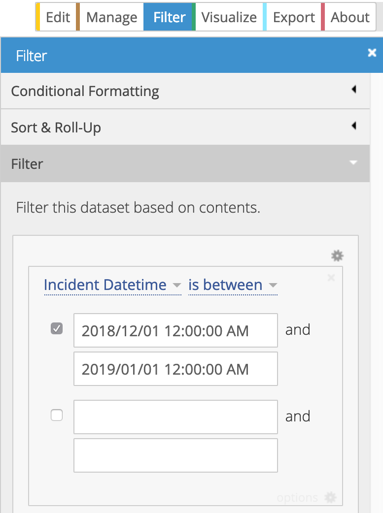
Students must visualize the SFPD Incidents dataset for the month of December 2018. The exact filter should be on the Incident Datetime column with is between as the condition and 2018/12/01 12:00:00 AM and 2019/01/01 12:00:00 AM as the dates:
There are 12,240 records in this dataset. Students are encouraged to apply different filters and aggregations to focus on a subset of this data. See the “Columns in this Dataset” section of the dataset page for descriptions of the columns.
Grading
The grade for this homework will be broken down as follows:
| Letter | Requirement |
|---|---|
D |
Prototype 3 unique visualizations in Tableau. |
C |
Implement 1 of the Tableau prototypes in D3. |
B |
Implement 2 of the Tableau prototypes in D3. |
A |
Implement 3 of the Tableau prototypes in D3. |
See the requirements below and the Homework Grading section for more details.
Requirements
Create one image (or SVG) per visualization. Each image should be no more than 960 by 500 pixels. Visualizations may be placed on the same webpage or separate webpages. Regardless, the homework website must have clear navigation to each of the visualizations.
See below for the detailed requirements for each letter grade level.
D Level Functionality
Prototype three different basic visualizations of the dataset using Tableau. Specifically:
-
Create at least three different visualizations. This means you need three different sheets in Tableau, and need to export three different images to include on your website.
-
Use at least two different encodings from the following list.
- Encode data using points (e.g. scatter or bubble plot).
- Encode data using bars (e.g. horizontal bar charts, vertical bars, stacked bars, grouped bars, small multiple bars, and histograms).
- Encode data using lines (e.g. line charts, multi-series lines, small multiple lines, and slope graphs).
- Encode data using area (e.g. area chart, stacked area, small multiple area).
- Encode data using heatmaps or pie charts.
Encodings belonging to the same item above do not count as different. For example, you may try both a stacked bar and a grouped bar chart, but these do not count as two different encodings in the list above. Therefore the third visualization may not use bars to encode data.
Other encodings must be pre-approved in a public Piazza post.
-
Use at least two different perspectives of the data. This can be achieved by grouping, filtering, or aggregating the data differently. For example, one visualization can use data grouped by weekday and another uses data grouped by category instead.
-
Use color to encode data in at least one visualization. This visualization must include a color legend in the static image export.
-
Use titles and axis labels where appropriate to make sure the encoding is clear. For example, include enough labels so that viewers can tell that category is listed on one axis and count is listed on the other.
-
For each visualization, include a caption that includes your name and a brief summary of what you can learn about the data using the visualization.
Export your Tableau visualizations as static images and include them on your homework submission website under the “Prototypes” heading. None of the visualizations for this homework assignment need to be interactive.
Use the “Dashboards” feature in Tableau to make sure your images will fit within 960 by 500 pixels and the legend and caption are clearly visible.
C Level Functionality
Implement one of your Tableau prototypes in D3. Specifically:
-
Use the same visualization technique and data encoding as one of your Tableau Visualizations. Required
-
Match as much of the design from your Tableau prototype as possible. This includes colors for non-data elements, style of grid lines, tick labels, sort order, and so on. Optional
-
Include the captions, titles, and legends found in your Tableau prototype in your D3 implementation. Optional
You only have to complete the required functionality to satisfy this grade level requirements, but you must meet the optional requirements before moving on to the next grade level.
B Level Functionality
This level has the same requirements as the C level functionality, except for a second Tableau prototype.
As before, you only have to complete the required functionality to satisfy this grade level requirements but you must meet the optional requirements before moving on to the next grade level.
A Level Functionality
This level has the same requirements as the C level functionality, except for a third Tableau prototype.
Hints
-
In Tableau, you can group together categories. Just click the categories you want to group, and select the paperclip icon to group them together. This will create a “Column Name (group)” dimension, and you can click that to edit the groupings and group names. This is especially helpful if there are many categories with very few items.
-
In Tableau, you can export the data specific to each worksheet. I recommend you use that data for each of your D3 visualizations to make things easier. For example, if you group by weekday in one of your Tableau worksheets, you can export a dataset grouped by weekday to use in your D3 visualization.
-
Keep in mind that showing data grouped by district may be misleading, since the districts do not have equal populations or areas. (I was not able to find population numbers or number or police officers per district/station.) It is still interesting to see, but you cannot conclude crime is more or less likely in one district versus the other without knowing more ground truth.
-
The visualization should be your unique take on the dataset. However, there are a lot of D3 examples on the web that you are welcome to reference. Just be sure to properly cite your references and avoid copying/pasting large chunks of code without attribution.
-
DO NOT VISUALIZE THIS ON A MAP. We’ll get to map visualizations later.