Prototypes
Our prototypes are divided into a few different types depending on their function:
Prototype Explaning Original Data
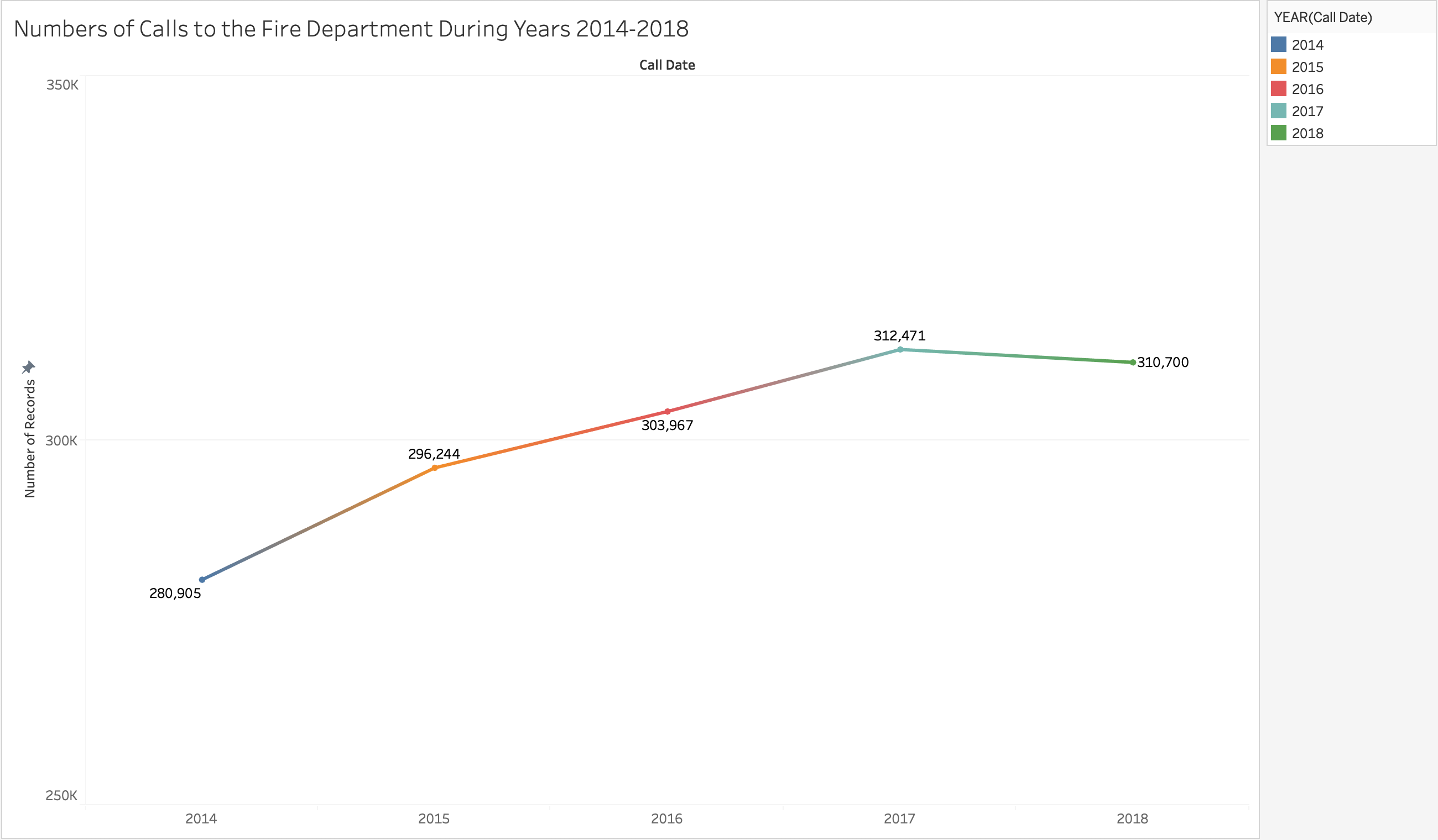
This visualization shows the trend of total number of calls rising through the years 2014-2018.
It simply helps us see the rising trend on number of calls which may correlate with the increasing
number of wildfires.
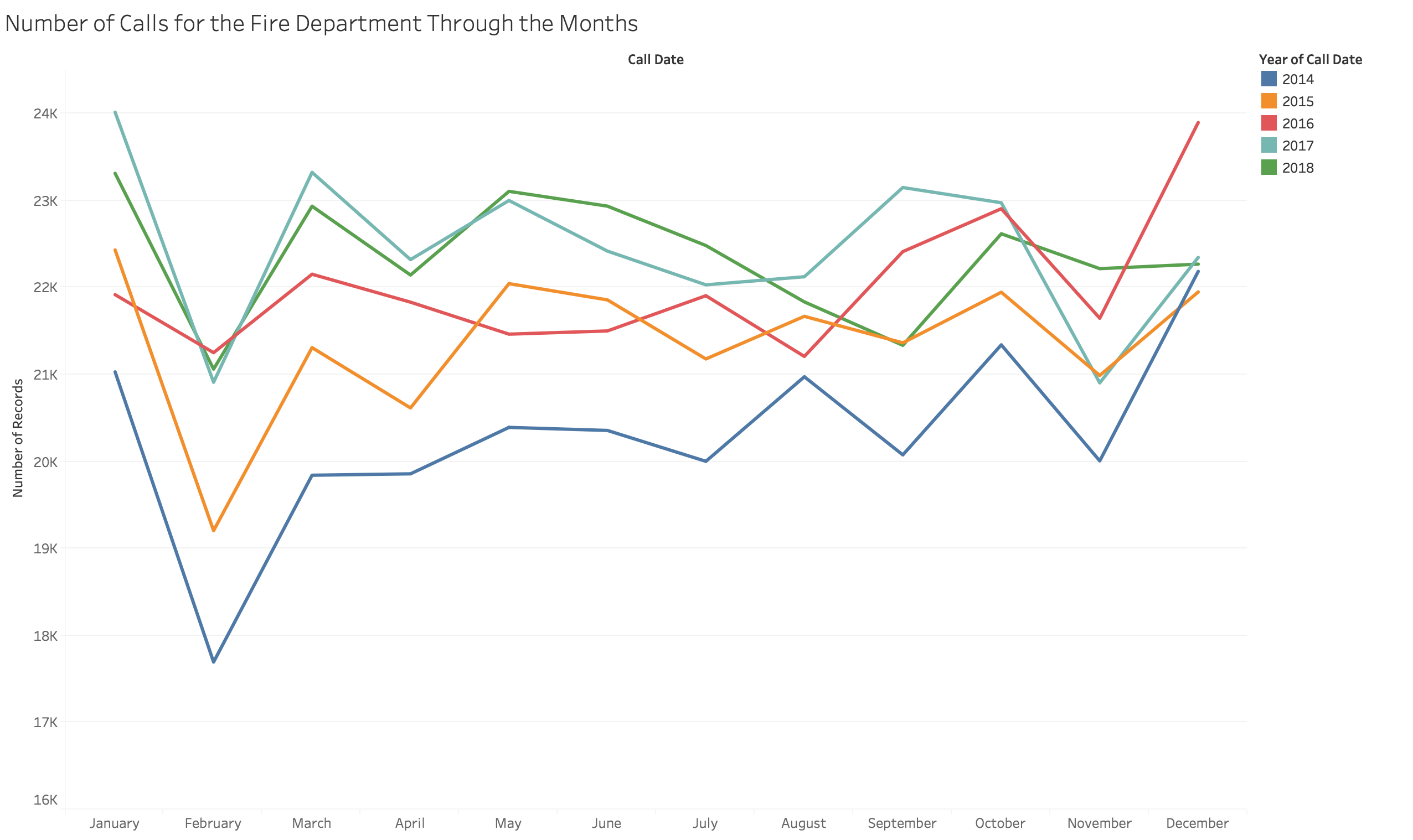
This visualization shows the monthly trends on number of calls for the last 5 years. It helps us
see which months see more calls than other through the years. From this visualization, we can
see that our assumption of "September-November" as peaks for fire-calls might be mislead.
Prototypes For Explaning Focus
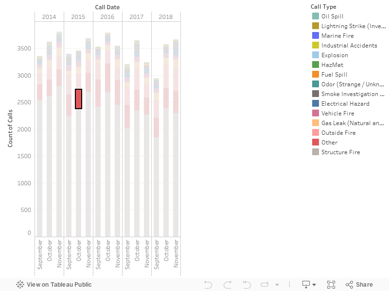
This visualization shows the types of calls made during the months of September-November over the last 5 years per each SF neighborhood. It allows for us to understand which types of calls are more prevalent, as well as which neighborhoods are more prone to fires.
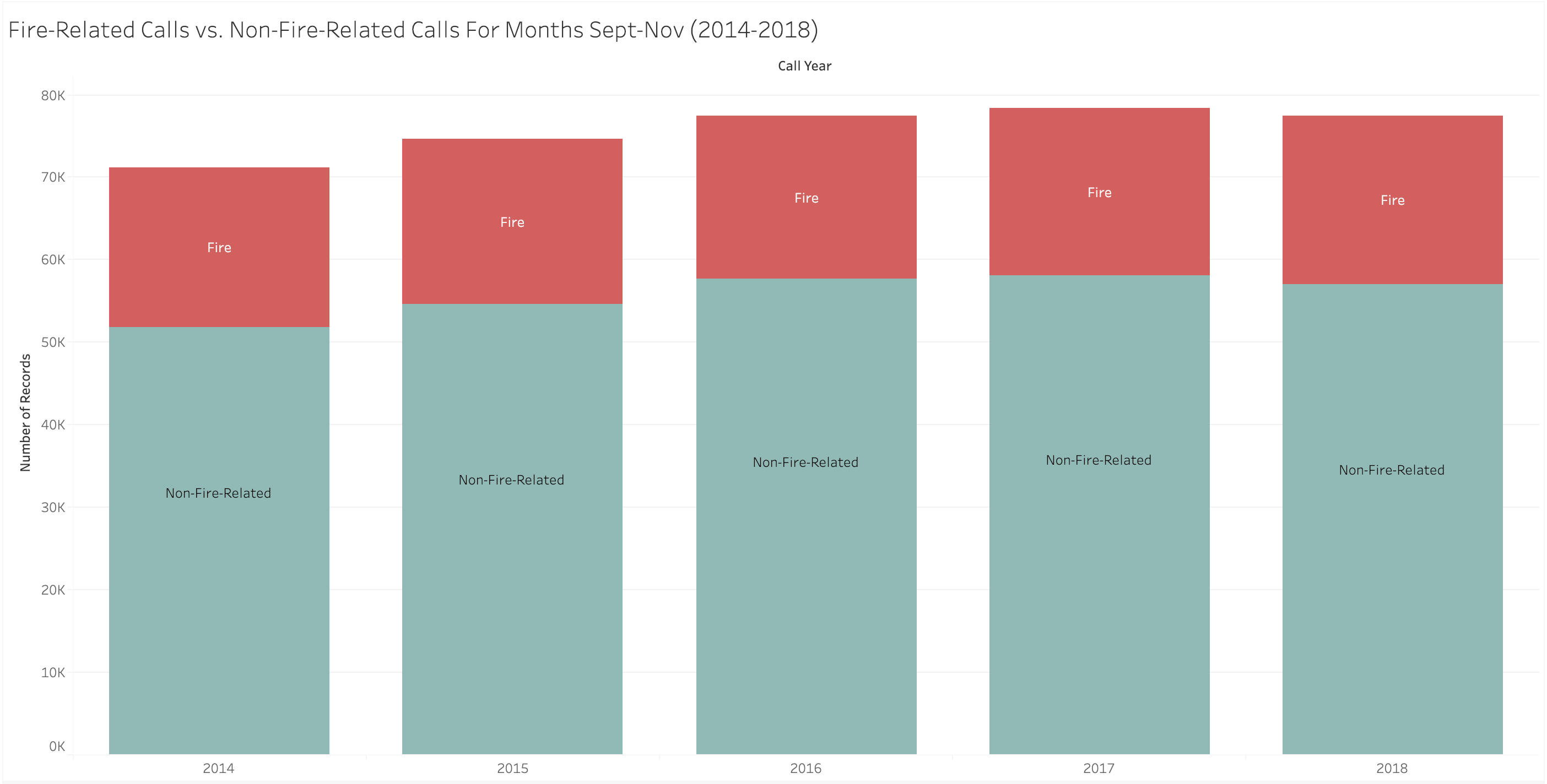
This visualization shows the proportion of Fire-Related calls vs. Non-Fire-Related calls made during
the months of September-November of the past 5 years. It shows that fire-related calls in San Francisco are actually
a small subset of the overall number of calls made to the SF Fire Department.