SF Fire Department service calls:Data analysis for the year 2018

The Rad Grads

Divya's Visualizations

Visualization-1 (D3)


Interpretation

The above stacked bar shows the number of emergency calls, made from San Francisco neighborhoods on th year 2018. Data for each neighborhood is grouped by call type groups which are mainly divided into four categories: Alarm, Fire, Non-Life threatening, Potentially life threatening. Mouse hover over each neighborhood's respective call type groups, gives the number of calls received for that group. Also change the values in the dropdown menu to sort the bar chart. Data can be sorted by Alphabetical (Neighborhoods)-ascending and Number of calls-descending.

Discussion

When the data is analyzed for each neighborhood, its shocking to see that most of the calls made to San Francisco fire department were for potentially life-threatening emergencies and the number of calls are pretty high. These calls need to be addressed with high priority and require to have less response time. The calls that are classified as 'Potentially Life threatening' are mainly medical emergencies.

The analysis of the data makes us wonder, why fire department has to respond to all the life threatening emergencies? The answer is explained in Lompoc Record
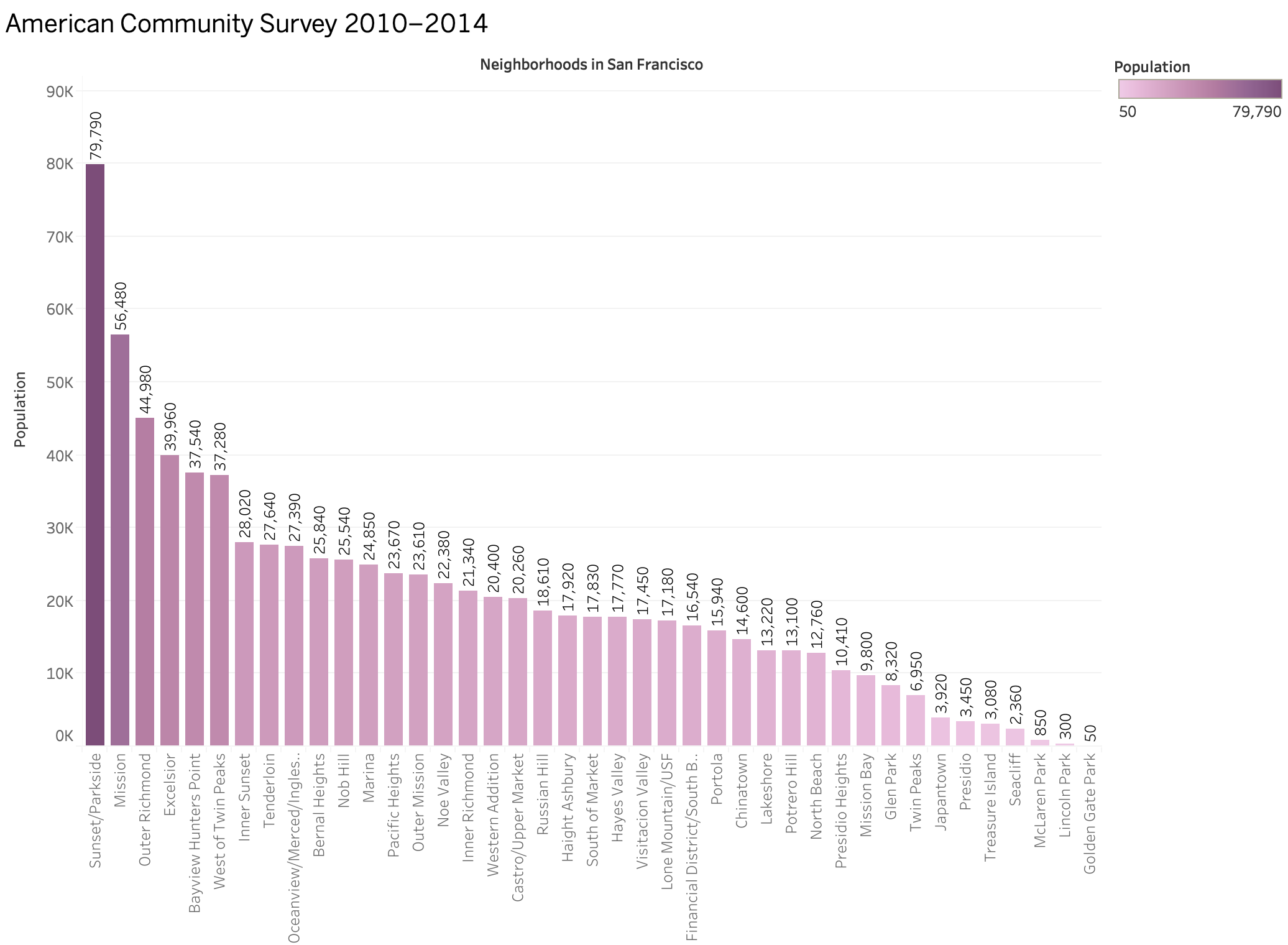
Click on the popup image below to see the population recorded on each neighborhood by sfplanning.org based on American Community Survey 2010–2014 (The image was made using Tableau by creating a csv file from sfplanning.org pdf manually). This helps to get a better understanding about the relation between population and emergency call records in each neighborhoods.

Credits

Data set:
Data SF

Code References:
KatiRG’s clickable stacked bar chart
Mike Bostock’s Sortable Bar Chart
w3schools

Other Supporting Data References:
sfplanning.org
Lompoc Record
How Fast Do Firefighters Respond?

Visualization-2 (D3)


Interpretation

The above bar graph shows the average travel time of SF Fire engines to each neighborhood, for Potentially life threatening emergencies. Average travel time is calculated from the difference of 'Dispatch Time' and 'On scene Time'. Hover over the bars to see the exact value of travel time. The bars can be sorted using the options in the dropdown above. Bars can be sorted alphabetically-ascending and traveltime-descending.

Discussion

The Visualization-1 is the motivation for Visualization-2. In Visualization-1, we discussed that number of calls for life threatening emergencies were high in each neighborhood. These calls should be treated with high priority and should be addressed with less response time. Inorder to explore more about the response times to each neighborhood, I chose to calculate average travel time to each neighborhood. Instead of considering the total response time, I chose travel time because response time is the addition of dispatch call duration,turn out time and travel time. Among the above times, the most significant one is travel time.

By analyzing the graph, we can see that fortunately for most of the neighborhoods, the travel time is very less which is around 5 minutes. From the articles mentioned in the credits, I came to a know that in a life-threatening medical emergency, first responders providing basic and advanced life support and arrive first at the scene of the incident to treat the patient until an ambulance arrives to transport the patient to the hospital, if necessary. The goal in 1710 (for career firefighters) is also states: 60 seconds to turn-out, 4 minutes for the first engine company to arrive, and 8 minutes for the full first-alarm assignment for at least 90 percent of all fire calls. But we see some outliers like Treasure island, Lakeshore, Visitacion valley, Presidio with travel time itself as around 7-9 minutes. This can be due to various reasons like traffic, road conditions, or station location and traffic. Refer to the pop up image below to see the different fire station locations in the city for a better understanding. We can conclude that there is a need to improve response times in some areas of the city.

Credits

Data set:
Data SF

Other Supporting Data References:
sf-fire.org
City performance score cards
NFPA 1710, 1720, and response time

>