Prototypes
.png)
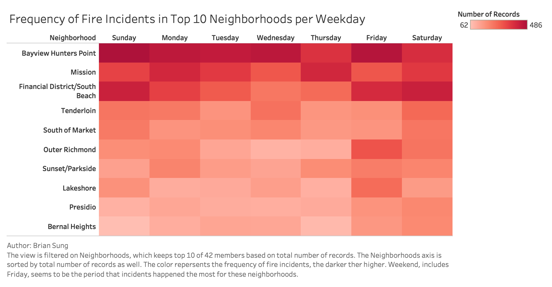
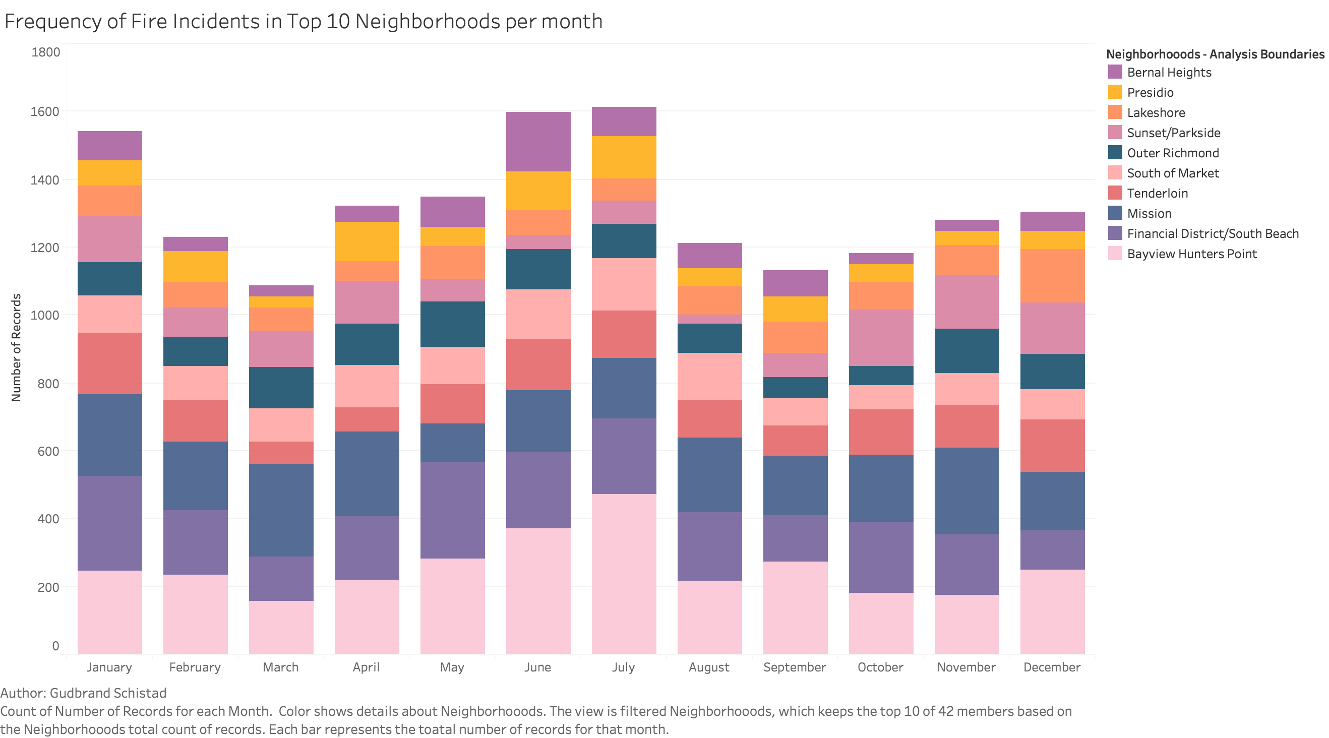
I received feedbacks that this was a nice visualization overall. Some improvements can be done such as: Removing Call Date label because it got confused with weekday. Sorting the neighborhood by descending order to get better readability, higher counts go up. There were some suggestions for the interactivity: Hover over weekday or neighborhood to brush so user can compare in different dimensions. Hover over the cells to show percentage of entire neighborhood.
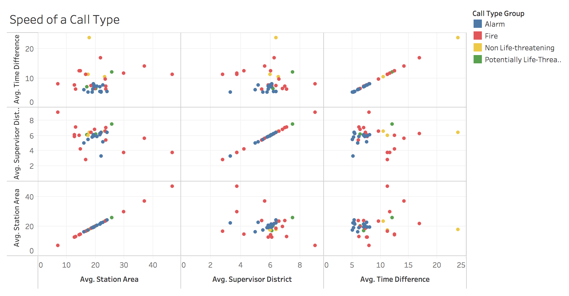
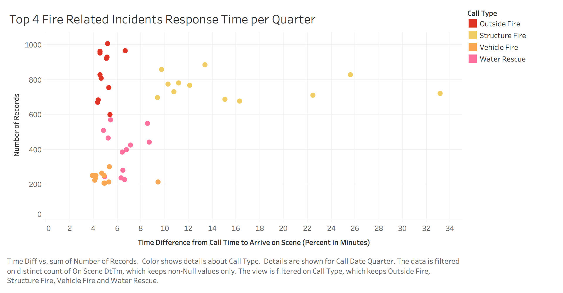
This was the original prototype. The main concern I got from the class, was that I was using variables that don't fit in particular of what I was trying to convey. So I decided to use a regular scatter plot. Remove the weird varaibles and use my time difference variable coupled within a time frame. There were some feedbacks regarding improvement of color scheme.
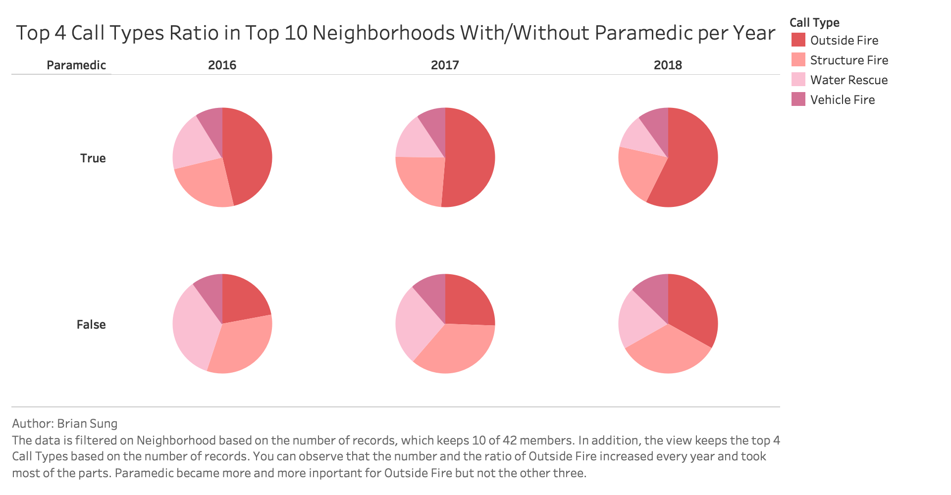
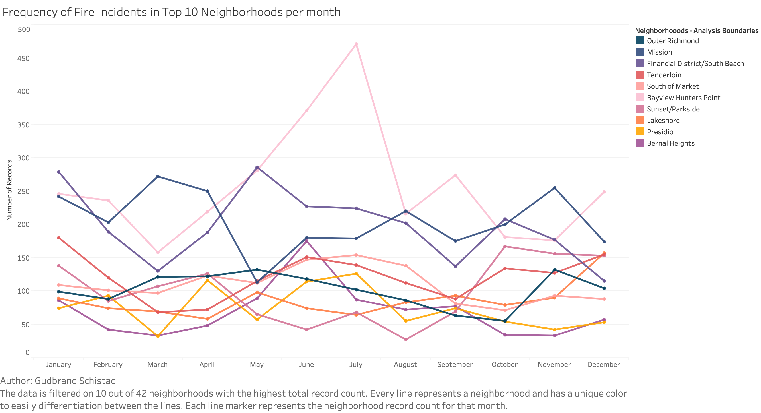
The majority of the feedback that I received for my prototype was very positive, and most of the comments that I received was in regards to the interactive part of the graph. Some of the changed that was requested was to have a color scheme that matched the rest of the visualizations and to also make it interactive so that the user could highlight a neighborhood. I also rotated the x-axis tick marks to make them more readable.