Prototype 1

Goal
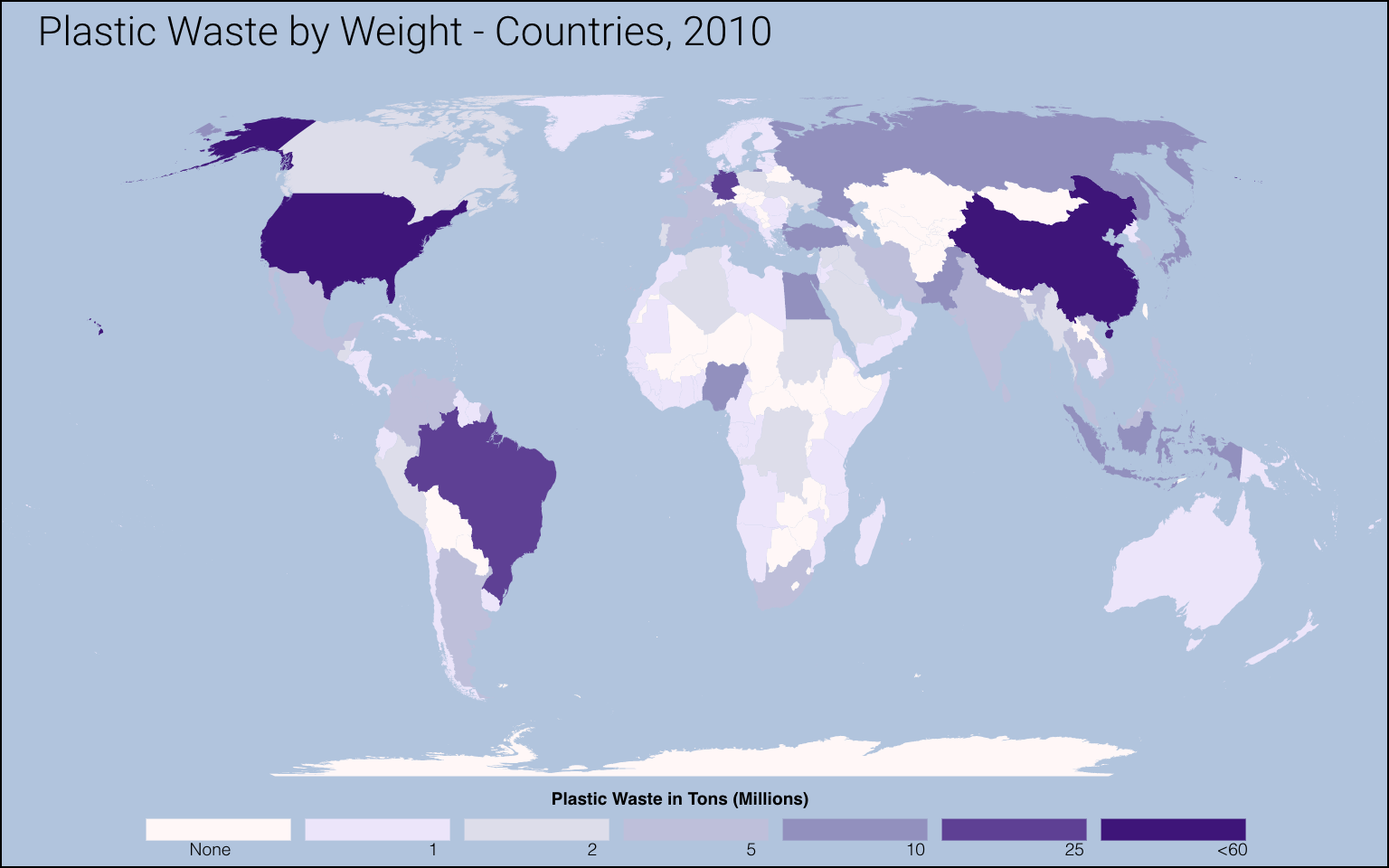
The goal of this visualization is to show a map visual to the user. Alone, this visualization is great because it allows for an easy comparison of countries, since the darker the purple the more plastic waste that country has discarded. However, I think another visualization next this graph that shows the amount of plastic waste per person is because a country on China has a bit more plastic waste than the US, but because China has quite larger population, that this map visualization has missing pieces of info.
Planned interactivity
I want to utilize the legend to brush the specific countries that match the specific number of tons of plastic waste and it should highlight those countries. As you hover over a specific country, I want to show the relevant data, such as name of country and the number of tons of plastics discarded.
data encoded
This is a choropleth plot. Each country is colored by the amount of plastic weight by tons. Grey means no data was given. Then we have different shades of purple. The darker the shade of purple the more tons of plastic there is.
Prototype 2

Goal
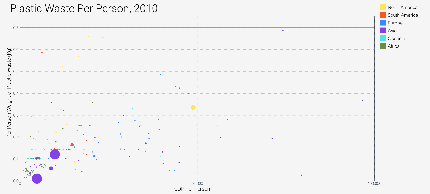
The goal of this visualization is to show the user how much plastic waste per person is discarded in that particular country. I wanted to show if there was a correlation of a countries gdp of how much plastic waste a person discards.
Planned interactivity
I want to utilize the legend to brush the specific continents. As you hover over a specific circle, I want to show relevant data, such as gdp and population on the side of the svg, near the empty area on the right side of the svg. I plan to have very small circles unlabeled, but if I hover over a circle, I want it to show the the label.
data encoded
This is a scatterplot. The x-axis is the Gross Domestic Product per Capita. The Y-axis is the plastic waste each person discards. Each circle's color represents the continent name. The circles size represents the population size.
Prototype (Beta)

Goal
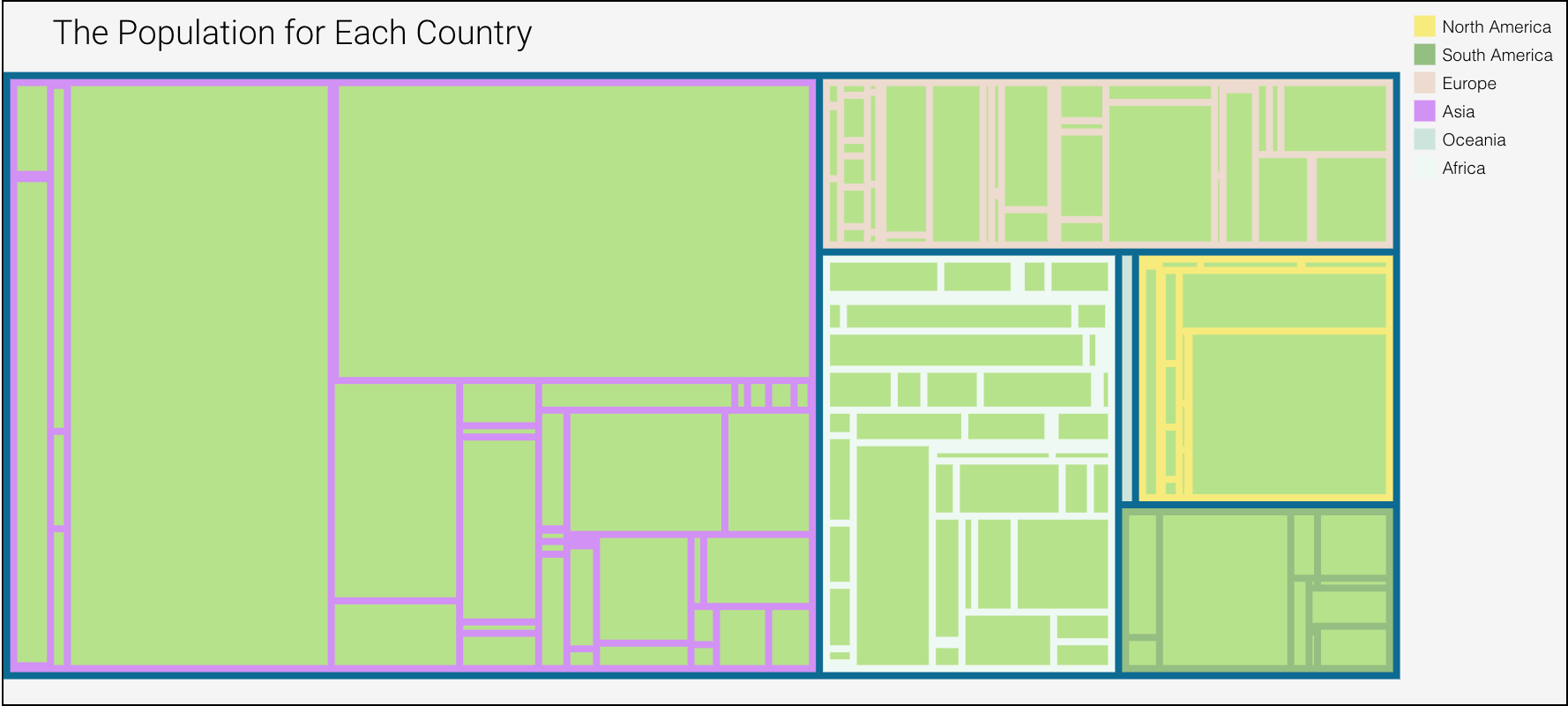
The goal of this visualization is to show the user a comparison between the population and discarded plastic. To see the transition of either the growth or decline of waste to population ratio.
Planned interactivity
I have implemented a tool tip and radial buttons to show comparison. Will implement a zoom feature, possibly zoom into a continent. Not sure what else I can implement for interactivity.
data encoded
This is a treemap. There are three depths. World, continents and countries. For each country the value will be either the population or the waste in million tones. Each continent depth is color coded.