Prototype (Beta)

Goal
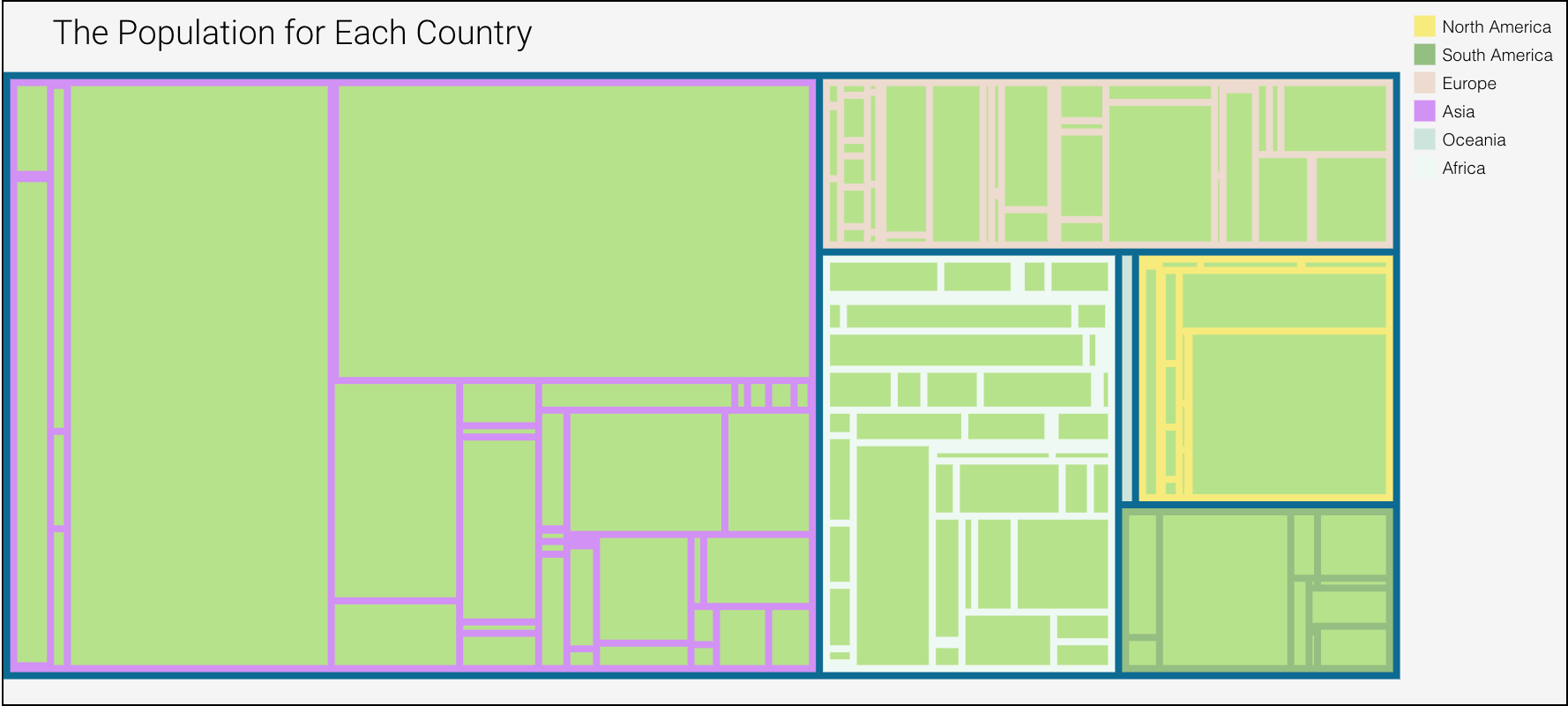
The goal of this visualization is to show the user a comparison between the population and discarded plastic. To see the transition of either the growth or decline of waste to population ratio.
Planned interactivity
I have implemented a tool tip and radial buttons to show comparison. Will implement a zoom feature, possibly zoom into a continent. Not sure what else I can implement for interactivity.
data encoded
This is a treemap. There are three depths. World, continents and countries. For each country the value will be either the population or the waste in million tones. Each continent depth is color coded.