Prototype (Beta)

Feedback Received
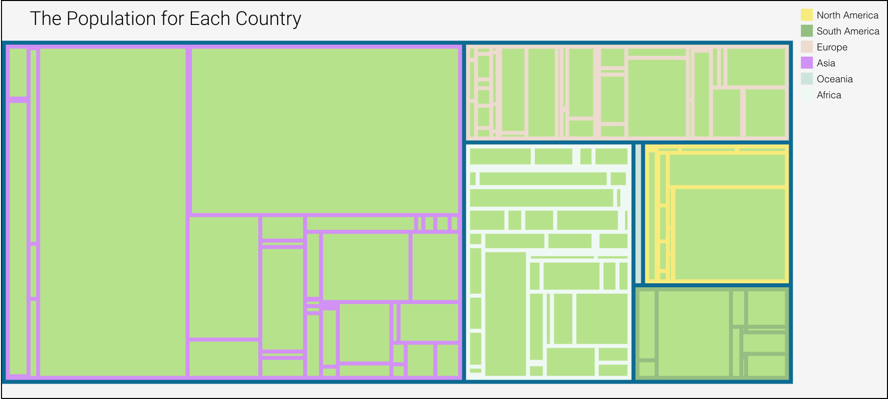
Most of the constructive feedback I received was my choice in colors and the lack of labels on the graph.
Non-color encoding- "Labels will help a lot with your graphs, especially the tree map", The interactivity is very good. But I cannot do the comparison between the population & pollution effectively. It takes some time.
Color-encoding- "The colors were nice, but I would like the background color to be something different than green as this is confusing me with south Africa."
What I did
I fixed the colors, the initial issue I had was figuring out what colors worked. So what I did was I kept most of the same colors as the continents, but for the countries I made the color a bit darker to distinguish between continent and country
I also added labels, I didn't add labels to all of the countries because I thought I would overwhelm the visual. So I only added a label to countries, that I thought were noteworthy. Like India, since it had a high population but a significant lower plastic waste.