Prototype #1

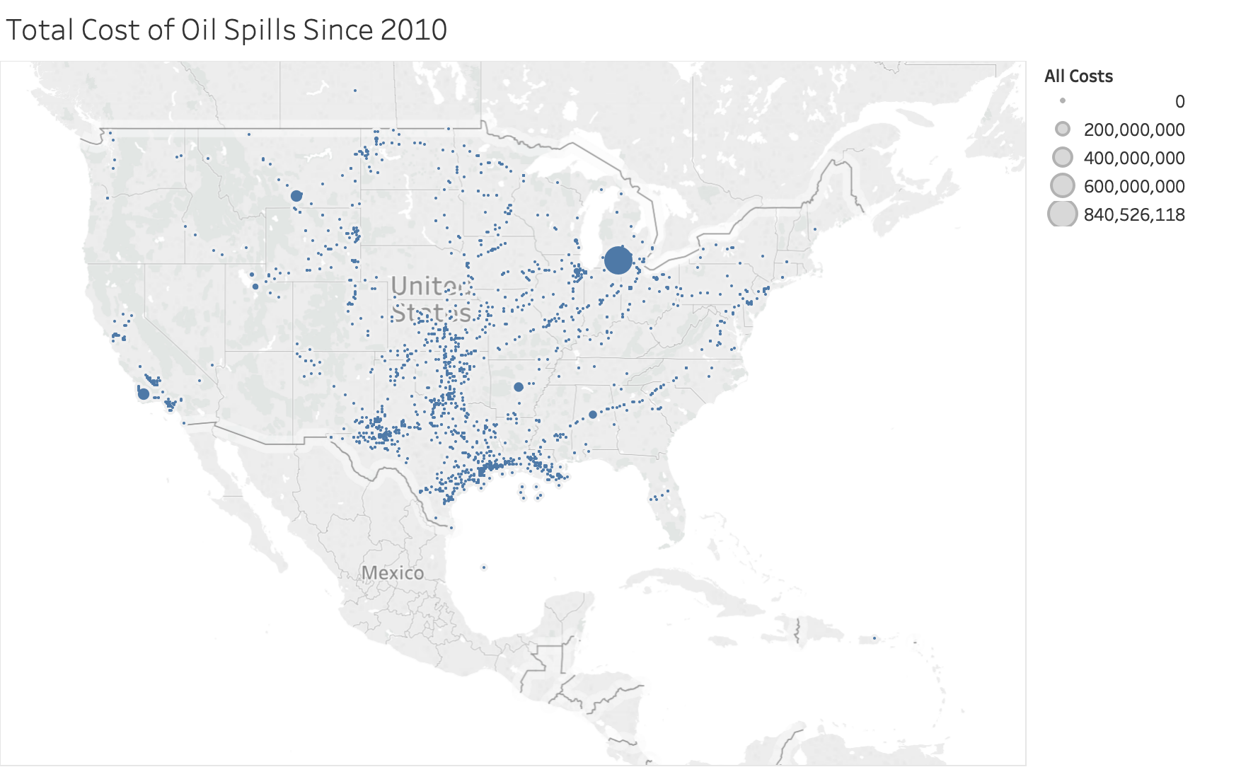
My goal for this visualization is to create a proportional symbol map that shows where oil spills happen and the total cost associated with each incident. The purpose of project is to reveal some interesting conclusions regarding oil spills in the United States. I plan to have some details on demand as well as some highlighting for the interactivity. I want to show the numbers associated with each individual oil spill when you hover over them and also highlight some of the more interesting data points. This visualization is a proportional symbol map that encodes the latitude and longitude of each incident. Each individual data point represents an oil spill and the size is encoded with the total cost associated with each data point.
Prototype #2

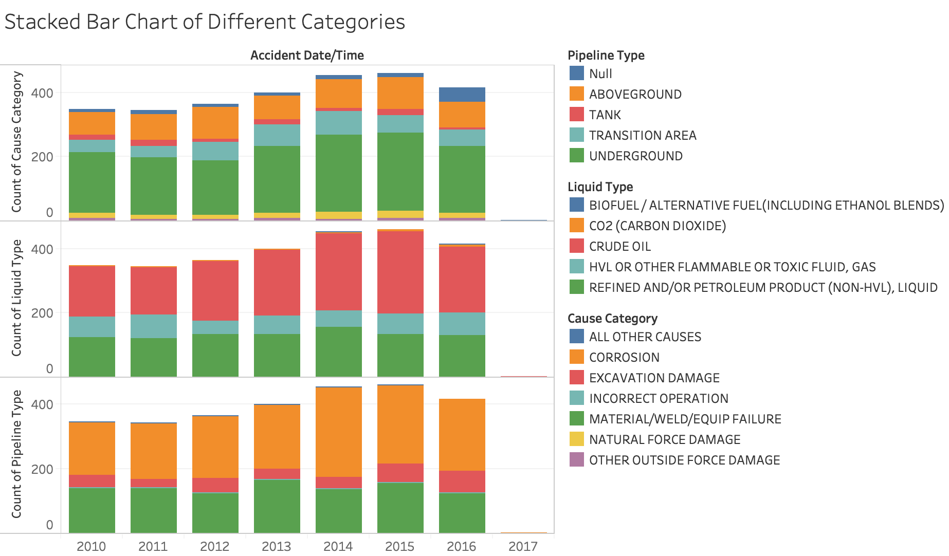
My goal for this visualization is to create a stacked bar chart to compliment the proportional symbol map to give some more context regarding the details of the spills that happen in each year. The purpose of project is to reveal some interesting conclusions regarding oil spills in the United States. For this visualization, I also plan to have some details on demand as well as some highlighting for the interactivity. I want to show the numbers associated with each individual oil spill when you hover over them and also highlight some of the more interesting data points. This visualization will be unique because it will change as I change the metric on the proportional symbol map.