Prototype of Visualization #1 - U.S. House Sale/Rental Prices Ten Years Growth Trend
Interpretation
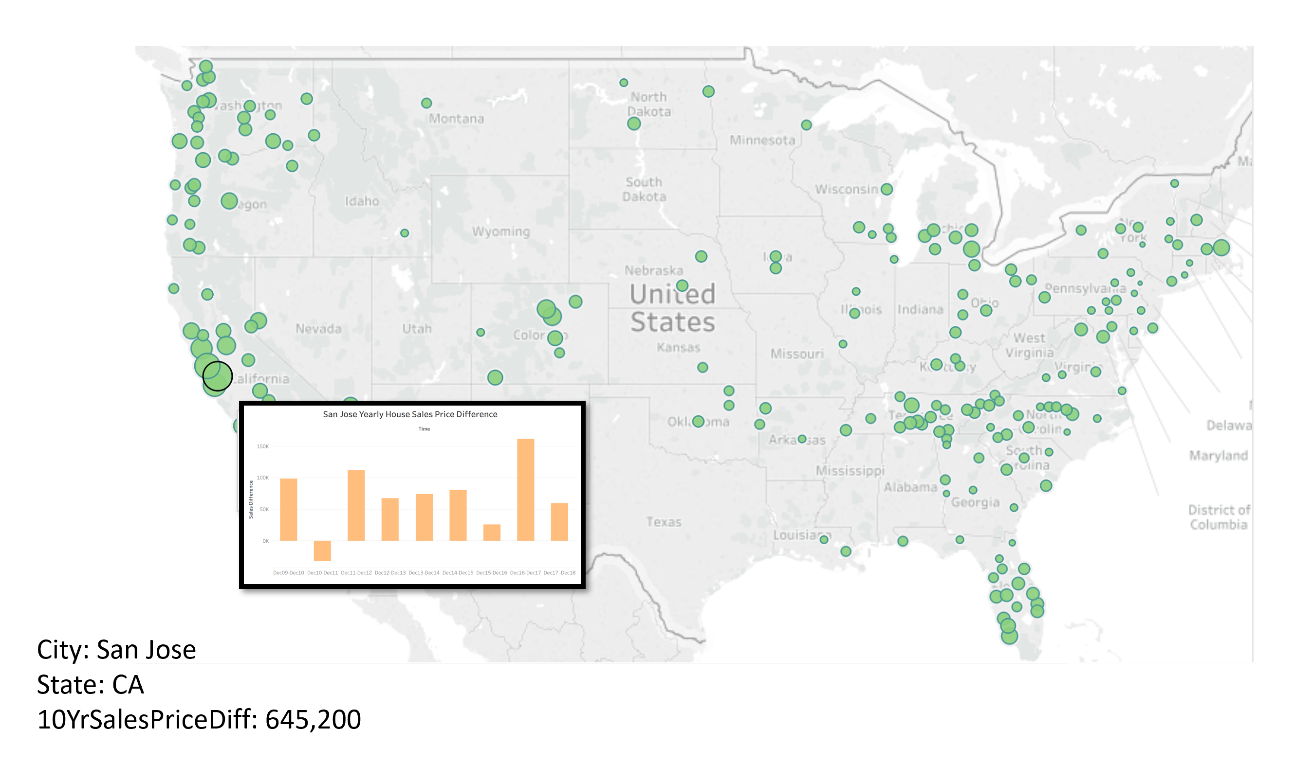
This D3v5 proportional symbol map, "U.S. House Sale Prices Ten Years Growth Trend", is combined with the following two map prototypes when the actual JavaScript code is implemented.
This map will analyze the U.S. house growth trend from March 2009 to December 2018, which is approximately a 10 year trend.
For the interactivities:
a) The user can visualize the size of each single bubble as each city's ten-year sales/rental price difference.
b) By selecting a drop down box, the user has two options of visualizations: U.S. house sales price and U.S. house rental price.
c) In either sales or rental price visualization, the user can mouse over a slide button for different time (measured by year).
d) When the user mouses over a single bubble, the bubble will show a more specific line chart which represents that specific city's year by year sales/rental price difference. At the same time, the city name, state name where the city is at, and the ten-year house price difference of that bubble/city will be dispalyed in the bottom left.
For example, if the reader mouses over the bubble representing San Jose, he/she can visualize the information like following the prototype of U.S. House 10 Year Sales Price Difference. (The same as the alternative visualization option: U.S. House 10 Year Rental Price Difference)
U.S. House 10 Year Sales Price Difference

Dataset that will be used in Visualization #1:
1. D3 Map with States and Countries (file source: us_states.geojson)
2. Home Listings and Sales (file source: salesDifference.csv)
Purpose
The reason to analyze this 10 year sale price trend is to let readers more directly feel the change, either increase or decreace, of the house sales price in the U.S. With the growth of the U.S. since the Great Recession in 2008, almost all U.S. sale prices are increasing. But still, there exists people who need to buy houses even though the price is increasing.
Where is an appropriate place to invest in real estate? In order to come up with a solution, I calculated the growth rate of U.S. house sales/rental prices over 10 years in visualization #2.
Prototype of Visualization #2 - Top 20 Cities Ten Year U.S. House Price Growth Rate
Interpretation
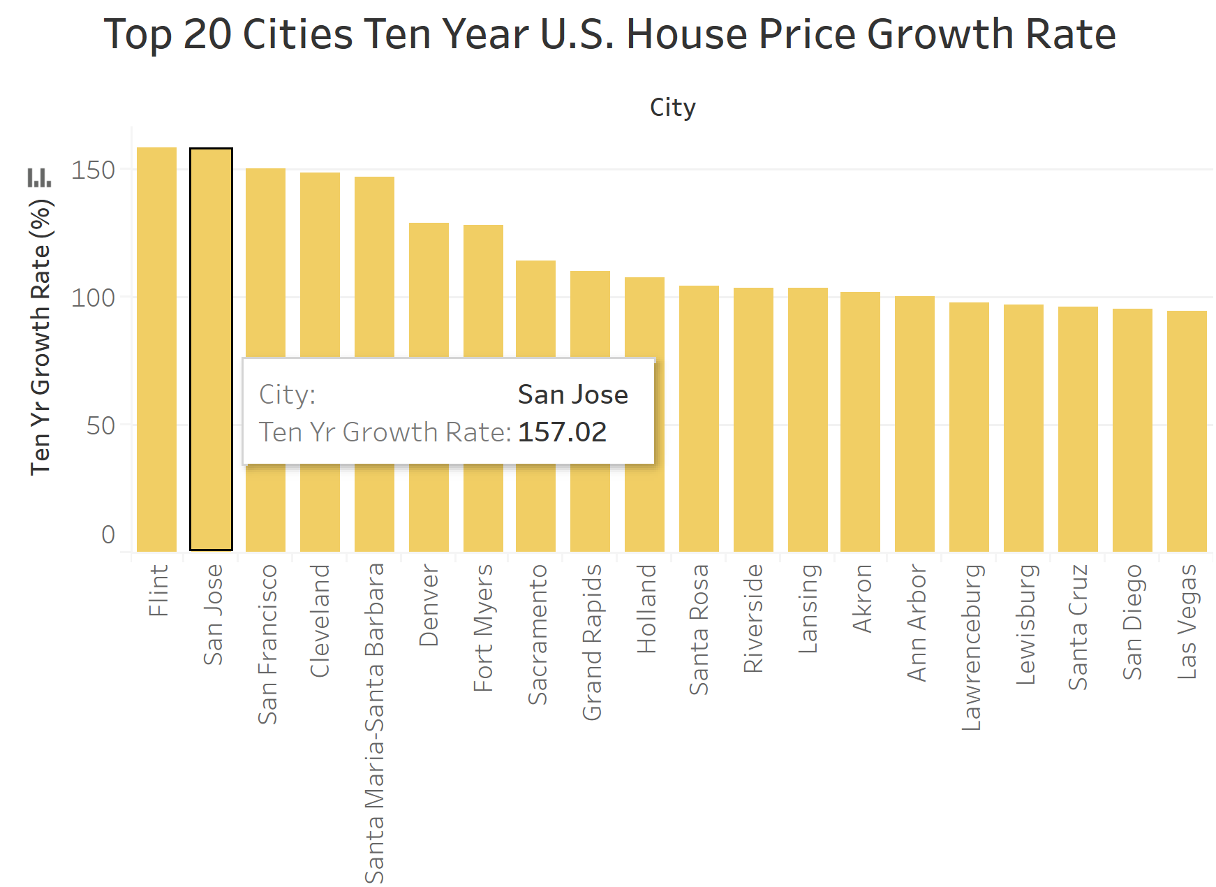
The second visualization is a bar chart which is called "Top 20 Cities Ten Year U.S. House Price Growth Rate", representing the top 20 U.S. cities's house sales/rental growth rate.
This bar chart will analyze the U.S. house growth trend from March 2009 to December 2018, which is approximately a 10 year trend. The x-axis represents the name of the 20 cities, and the y-axis represents the growth rate of sales/rental price in percentage.
For the interactivities:
a) By selecting a drop down box, the user has two options of visualizations: U.S. house sales price growth and U.S. house rental price growth rate.
b) In either sales or rental price growth rate visualization, the user can mouse over a single bar and see the information like the below prototype.

Dataset that will be used in Visualization #2:
1. file source: salesGrowthRate.csv
Purpose
Just as I mentioned when I analyzed visualization #1 - with the growth of the U.S. since the Great Recession in 2008, almost all U.S. sale prices are increasing. But still, there exist people who need to buy houses even though the price is increasing.
Where is an appropriate place to invest in real estate? In order to come up with a solution, I visualized the growth rate of U.S. house sales/rental prices over 10 years in this visualization.
With the Growth Rate of both sales (visualization #1) and rental (visualization #2) price columns generated, I'm going to show a line chart to analyze the price/rental growth trend. And readers can decide the valuable place to invest in real estate by several investment tips below:
😊The bigger the growth rate of house price is, the more valuable the house is.
😊A valuable city to invest in real estate is a place that has both increment of house sales price and house rental price.
😊From the line chart, if you visualize a city that has house sales growth rate > house rental growth rate in the long term, it's probably not a good place to invest in real estate.