Visualization 2
Emmit Parubrub
Visualization 2
Interpretation
This heatmap visualization displays the relationship of the top six San Francisco Fire Department neighborhoods (excluding Lincoln Park) that have the worst travel times (in minutes) from December 2018 to February 2019. These times were calculated from the time that firefighters were dispatched to a reported medical incident and the time the firefighters arrived to the scene of the incident. Please see our Data/Processing page for more information on the data and processing. This visualization maps these times to the day of the month and averages them to condense information and analysis. Additionally, the neighborhoods are sorted by worst averages starting with Treasure Island which has the worst (largest) time averages and the Financial District / South Beach neighborhood which has the least time averages out of the six.
Discussion
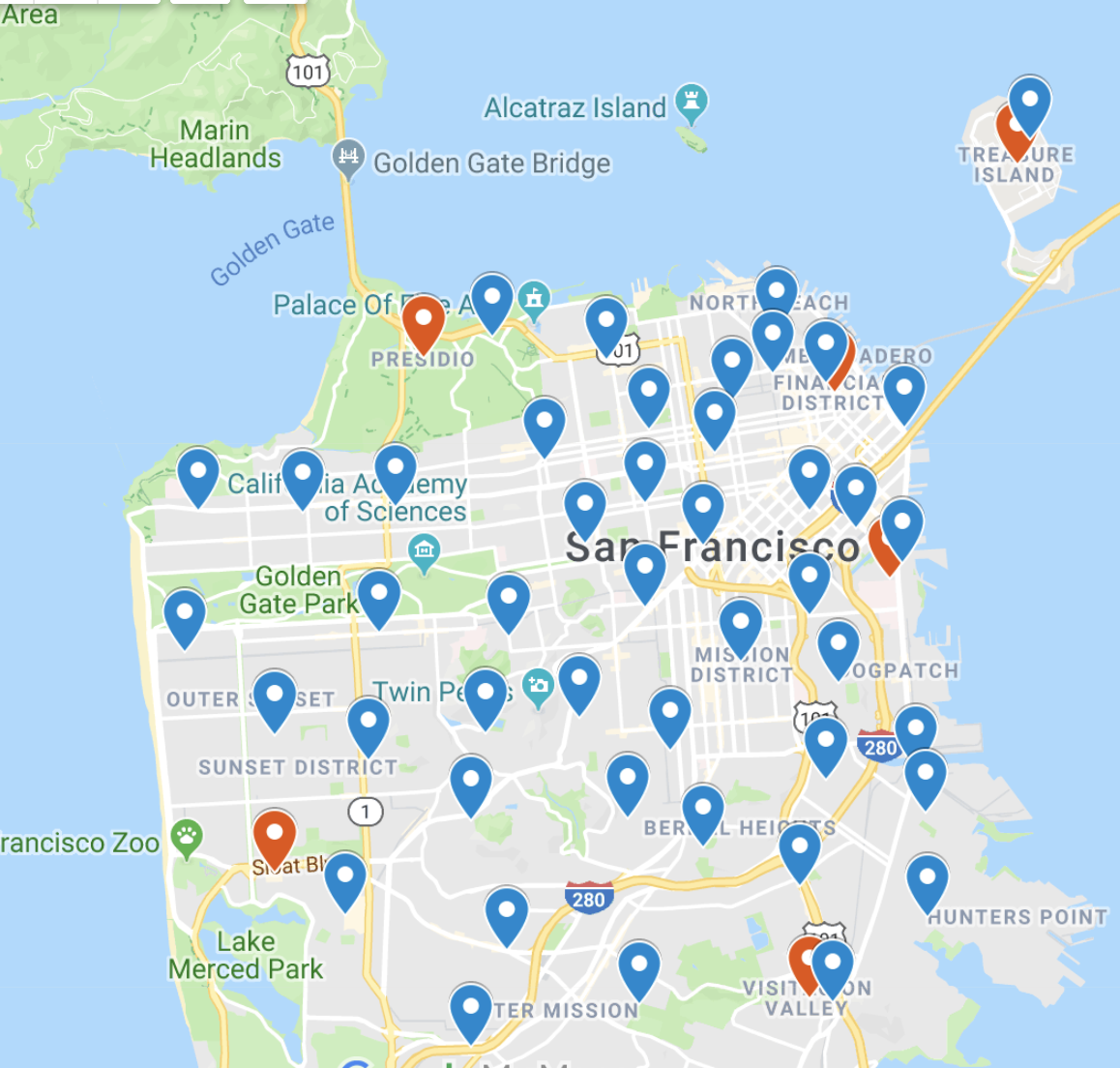
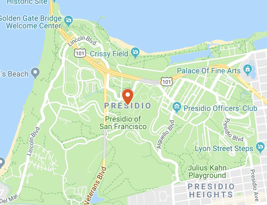
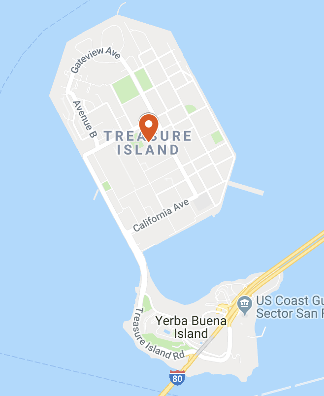
From the heatmap alone, we can get an understanding and comparison for what a long travel time is by hovering over the darker shaded areas. We can also see some empty spaces in the Presidio neighborhood. Although this identifies that there is some missing data, we can still get some information from the Presidio neighborhood. Thinking about where the Presidio is, there isn't as many people or structures in the area compared to the rest of San Francisco. Also, the Presidio has a lot more nature and roads that are paved around the trees. From this analysis, we can make a connection as to why the Presidio has one of the worst run times and why it has missing data. Since the Presidio is mostly made of natural fields instead of roads and structures, we might be able to make the assumption that firefighters might have a harder time getting to the scene of these incidents. Since the Presidio has less people in the area, we might also make the connection that the Presidio might receive fewer calls, thus concluding an idea for why there is missing data. After making this analysis on the Presidio, I decided to map out the San Francisco Fire Department Stations in comparison to these neighborhoods. In the pictures above, I plotted the stations in blue and the neighborhoods in orange. We can see that most of these neighborhoods are on the outskirts of San Francisco. Like the Presidio, Treasure Island seems difficult to handle as there is only one station that takes care of the entire island. With the few other neighborhoods, it seems like there is also a potential for lack of aid from surrounding stations except for the Financial District / South Beach which has the least time averages out of the six neighborhoods.
Overview
Overall, it was very interesting to analyze so much data from the San Francisco Fire Department. Although there were some errors in the data, it was very informative and interesting. Three months and one incident type alone had thousands of entries. My main interest though, still lied within these time spans of how long it took to reach the medical incidents because those few minutes could mean life or death.
Credit
A huge thank you to the following for data, inspiration, and code:
Data: Fire Department Calls for Service.
(Check our Data/Processing page for more information)
Template: This template was used from the University of San Francisco's CS 360/560 Data Visualization class.
Code/Examples: Credit to the book "Interactive Data Visualization for the Web" by Scott Murray for code and inspiration.
About Me
Emmit Parubrub
My name is Emmit Kamakaniʻoluʻoluʻokoʻolau Kahaʻulelio Parubrub and I am a student at the University of San Francisco
majoring in Computer Science. I was born on the island of Oahu, Hawaiʻi and raised in Kahaluʻu. I love being in the ocean,
the mountains, or the gym but I have always been fascinated with technology. When I was a child my environment was very
rural and filled with nature so when I would see new technology I would be interested and intrigued by how it worked.
I am majoring in computer science to foster child-like fascination and passion for technology.
Github
•
LinkedIn