Prototypes
Team Prototypes for Individual Visualizations
Prototype 1

Improvements on Prototype 1
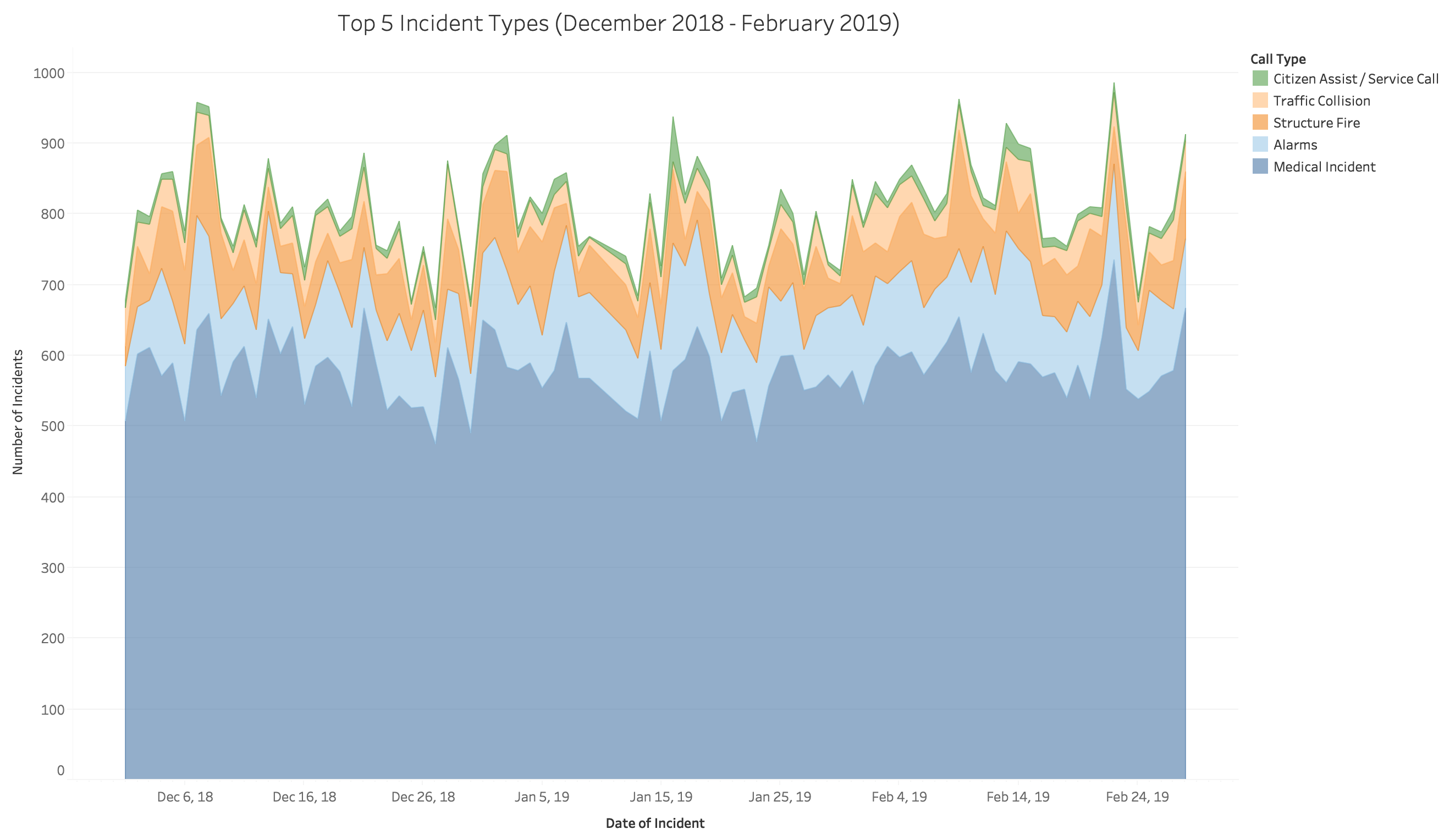
After speaking with classmates, I recieved feedback saying that a stacked area chart was good for trying to understand the most called in incidents, but my area chart had too many categories and was therefore making the data less informative and straight forward. Because of this feedback I decided to limit the number of categories I used in my stacked area chart to 5 call types. Some other feedback I got was to group the areas so that the biggest area is on the bottom and the smallest area is on top to make the data easier to read. I also decided to add a legend to match the color of each area chart like the first prototype.
Prototype 2
Improvements on Prototype 2
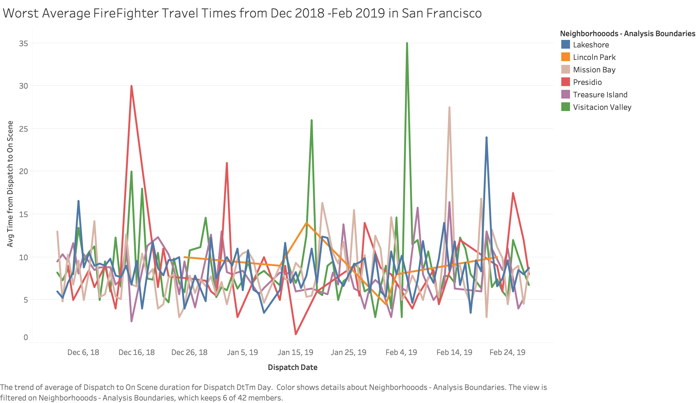
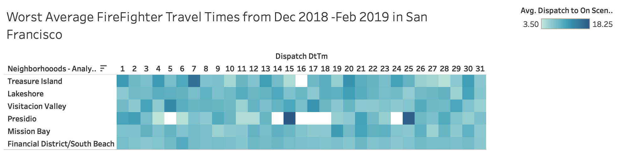
After speaking with classmates, most people said that my initial prototype (above) was a bit too cluttered. Many suggested that I use a different method of visualizing the data and one method that was frequently suggested was a heatmap. Most people also liked the idea of analyzing firefighter travel times so I kept it and applied the data to a heatmap. After some trial and error, my new prototype condensed the timespan to days of the month and I ended up with the prototype below.
Prototype 3
