First Alpha Prototype

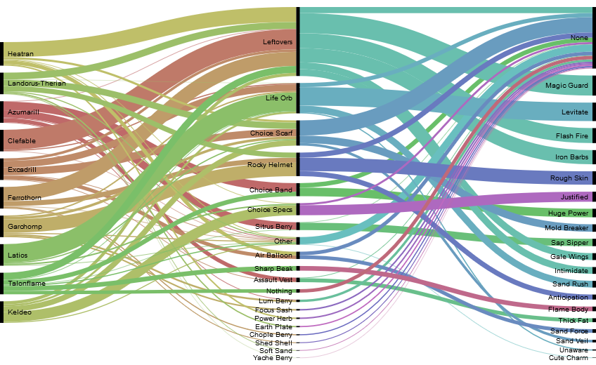
The goal I have in mind for a visualization like this is that it's meant to try and represent the flow of certain Pokémon and their builds; this example utilizes abilities and items. This prototype also uses the top 10 Pokémon found in the OU tier. While I am planning on increasing this number, the idea is the same; showcasing the most used Pokémon, their abilities, and their items, in order to offer insight into how some of the best builds were utilized. I also wated to try this out for teammates for certain Pokémon. The planned interactivity here would be brushing, highlighting certain pathways based on what's clicked on. Currently, this is an Alluvial Diagram prototyped in RAWGraphs. The first step lists the Pokémon, the second step lists their item choice, and the third step lists their ability choice. The size is encoded using the percentage of use of each item per Pokémon.
Feedback
I received no feedback on this visualization, as I realized this visualization would not work with the data I had, which was already aggregated.
First Beta Prototype

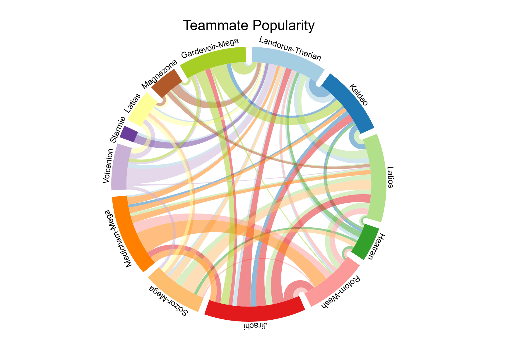
The goal I have in mind for this graph is to examine teambuilding more. While the most used Pokémon are likely to be featured on many teams, what I'm looking for is to perhaps identify which Pokémon make good support members, and thus lead them to be usable alongside a variety of other teammates, compared to other Pokémon which have a specific niche and thus are often only used alongside certain other teammates. Currently, this is a chord diagram prototyped in Charticulator. Each segment of the ring represents an individual Pokémon, while the chords are encoded by color and strength of the relationship (a weighted relative number of how many teams the two Pokémon occur together on).
Feedback
I recieved a lot of feedback on this visualization, including the addition of a sidebar to make selections (in case the segments became too small), the ability to rotate the chart to better view the names, adding in the color scheme based on typing, and grouping them based on typing. Out of these, I implemented the color scheme, while I put in some different ideas to help address the other issue. In the final version, the names are all horizontal with lines leading to the appropriate segment. The segments aren't too small for the user to interact with either.
Second Alpha Prototype

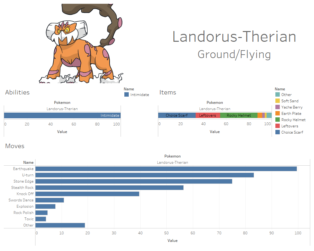
This prototype visualizes the various data found in Smogon's usage files, which in this case includes the ability, items, and moves used on that Pokémon within the tier. The abilities and items are visualized in stacked bar charts of 100%, since only one can be used on a single Pokémon. A Pokémon can use up to four moves, though, so these are instead visualized in a standard bar chart, where their usage is again out of 100%, though for each move individually. Planned interactivity is a details on demand tooltip that provides the name of the ability/item/move, and possible other statistics about it, as well as a selection visualization that allows the user to choose what Pokémon they want to display the statistics of. Currently, this is a small multiples visualization prototyped in Tableau.
Feedback
The names on the bars were considered redundant since there was a legend for the stacked bar charts. While initially I was planning to do it this way, the feedback that I should make colors be based on Pokémon typing caused me to change them from stacked bars to standard bars, in order to have a consistent color scheme.
Second Beta Prototype
A more fleshed out version of the charticulator chord diagram, with complete data.
Feedback
No feedback was recieved, as this visualization was created after feedback exercises.