Discussion
This is a heat map showing the Earth's land temperature variation in degree celsius for the years 1850-2015 over different months.
Heat map was chosen for the analysis as it encodes time series data efficiently. This is an important visualization for the analysis of climate change.
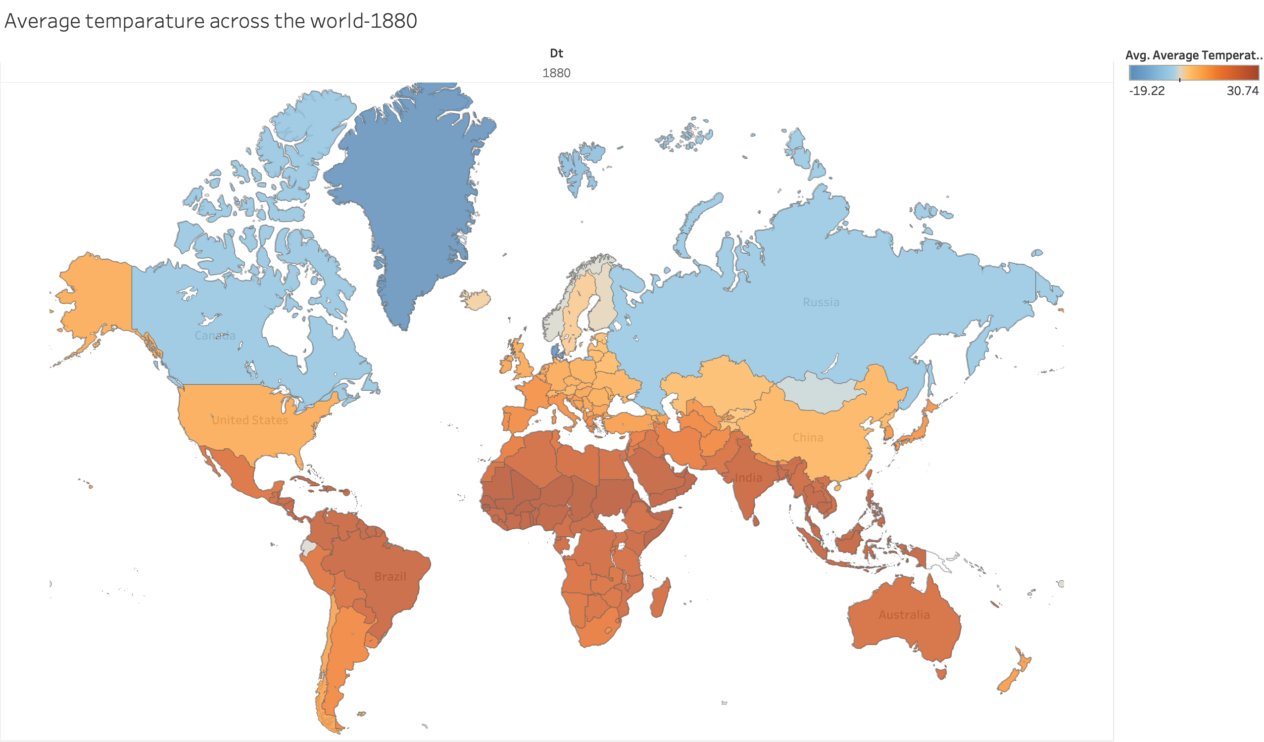
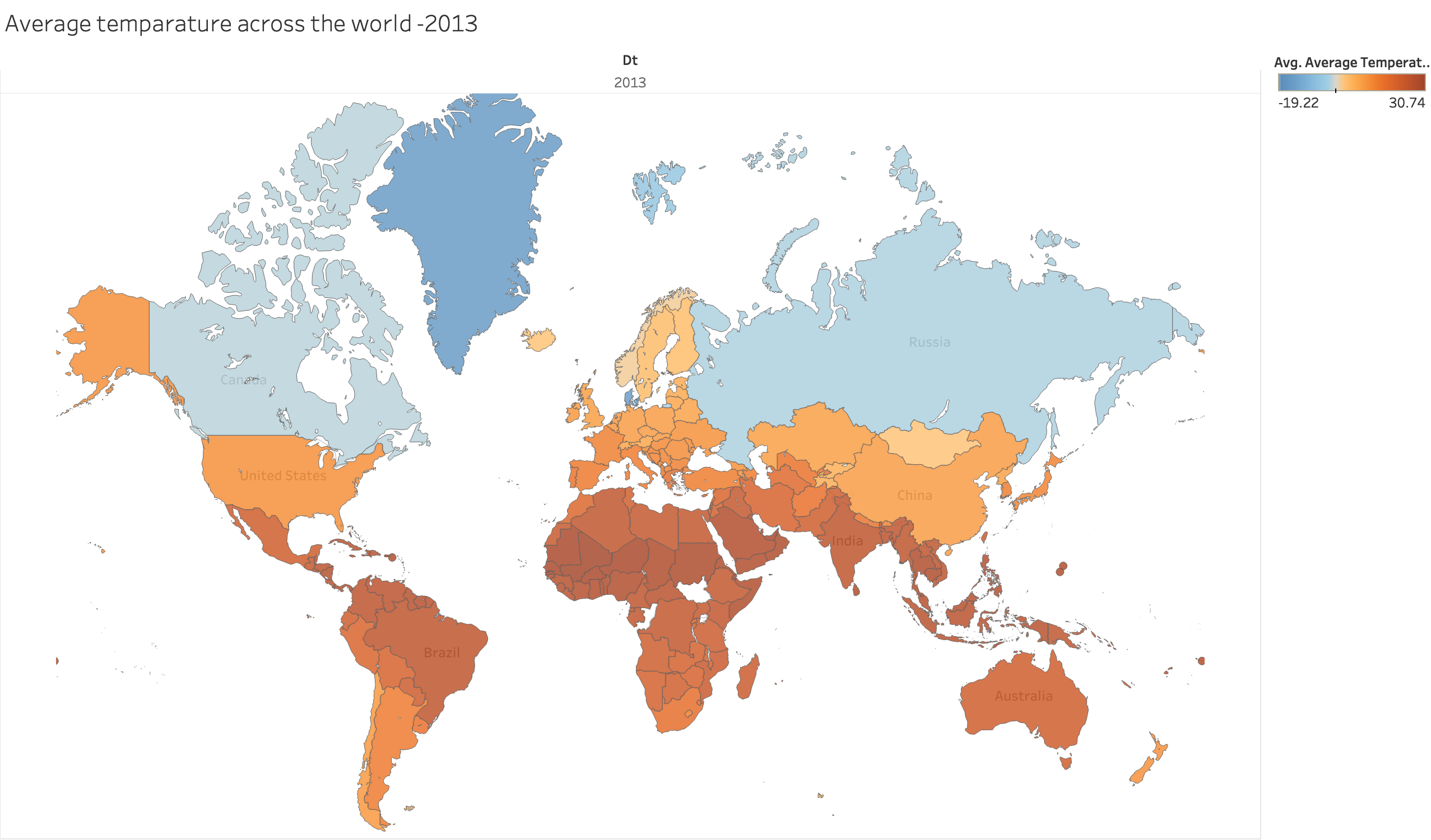
The temperature here is encoded using color. The light colors show low temperatures and dark colors show the high temperatures.
From the analysis of colors, we can see that there is a gradual increase in the color density.
This shows that there is a gradual increase in Earth's surface temperature over the past years, which is the evidence of climate change.
Interactivity: The planned interactivity is, when mouse click on a row , the row is highlighted for the user, to focus on the particular month.
Also on the side panel, it will show the temperatures in the years 1850 and 2015, and the difference in temperature.
Data and Processing
The raw data set GlobalTemperatures.csv was used for creating this set of prototypes. The data was processed using Tableau.
The original data set had 3200 rows and 9 columns for the years 1750 to 2015 for different months, different days. But data was missing for some of the years and for some months.
Since the average is used to represent a month's data, I filtered out the years with missing data, otherwise it can be misleading. Data was filtered by year, from 1850-2015, in 20 year intervals.
The aggregation of data over a month was done by calculating average temperature for a month.
Feedbacks Received
The feedbacks for this visualization was given through peer reviews . Main points from feedback are :
- The temperature can be shown in fahrenheit instead of showing in degree celsius as
fahrenheit is the common temperature scale used in US.
Final versions improvements: I implemented this approach.
-
The color gradient is indicating that the weather is getting colder over time instead of getting hotter. A better color gradient can be chosen to reduce
the lie factor.
Final versions improvements: I used orange color-linear gradient scale for the heat map.
-
Make the color scale description better, saying it is showing the average temperature in degree celsius or fahrenheit.
Final versions improvements: Added clear titles and legends.
-
Can include maximum data that is available, not just the data in specific intervals to improve data density
Final versions improvements: I included the data from 1755 instead of 1880.
