
Beta Prototype
Goal
My optimal goal is to have two visualizations, one choropleth map with total number of incidents/police reports and the other will be a line chart showing offensive type incidents of the specific neighborhood throughout the years. A conclusion can be made to see if San Francisco has gotten safer with less incidents over the years while also taking under consideration of any changes within the city over the years such as technology.
Interactivity
The planned interactivity is to have the neighborhood, date, resolution and description for each circle on the map when the user hovers the cursor over them. A function for viewing the choropleth map by year (2003 or 2019) will be used for the user. Also, the line chart will change depending on the neighborhood the user highlights on the choropleth map.
Encoding
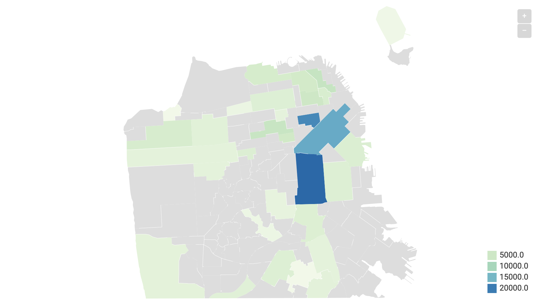
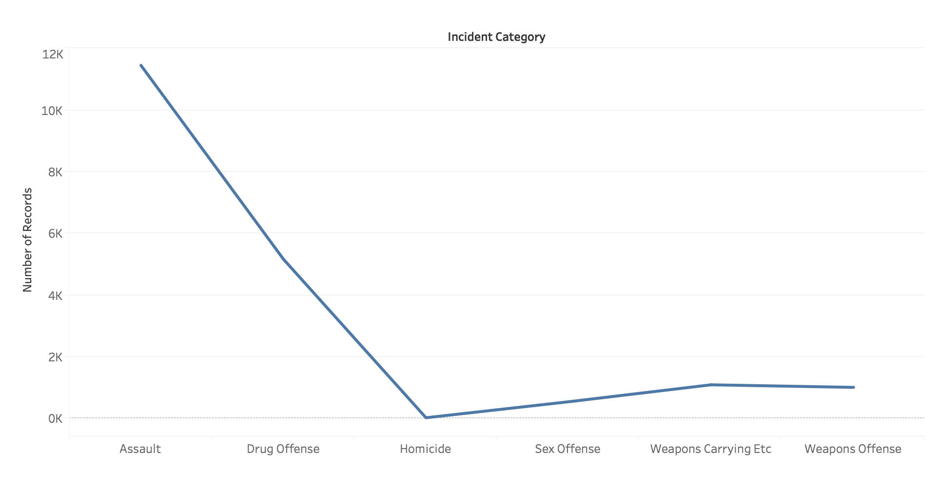
This is a choropleth map of total incidents for each neighborhood in San Francisco. Each neighborhood and incidents came from the Police Incident Reports csv file with no filters currently. The line chart uses the same csv file with Incident Type filtered to those that are categorized as offensive.
Credits
Choropleth map created using Data Wrapper.