
Original Beta Prototype
Feedback
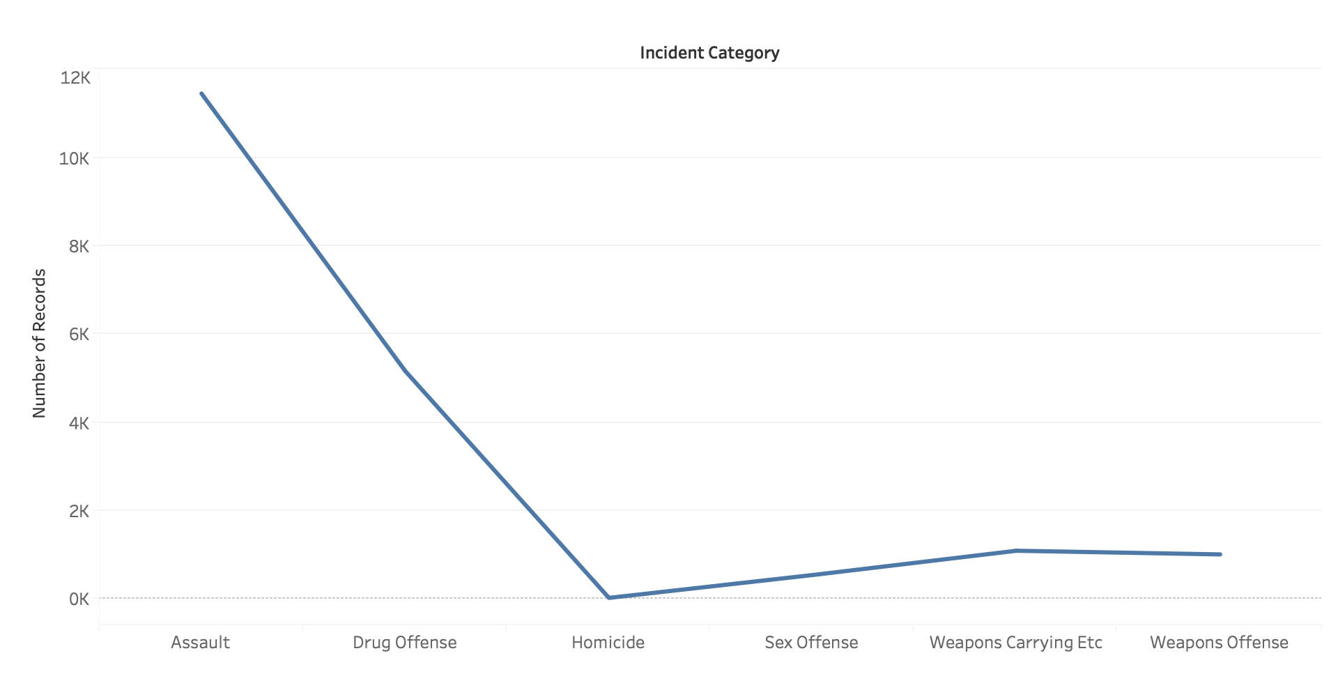
- The most feedback I've received is changing the line
chart to a bar chart as it shows the numbers clearer, expresses
my project goal better, and improves upon the data ink ratio.
- A minor change a lot of people urged on was to give more context
for the legend. Adding words to make it clearer for viewers.
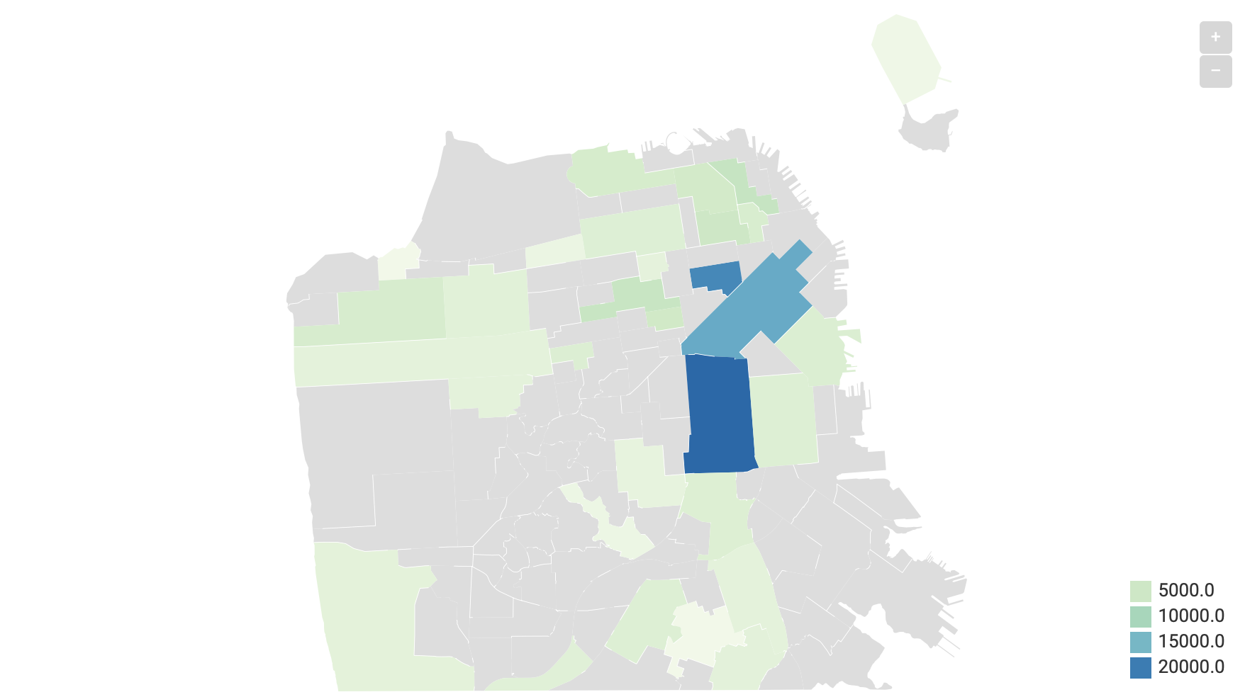
- A lot of my peers were concerned with the data density, as there
were many gray areas with no data in the beta prototype.
Feedback Effects
- Changed the line chart to bar chart as advised by many.
- Turned out the GeoJSON map I've used for the beta prototype was
incorrect for the data set of this project, hence the huge grey areas.
I found the correct GeoJSON eventually and all areas were filled with
color now.
- Improved on the legend and gave more context to be more descriptive
and clearer for viewers.