Alpha Prototype

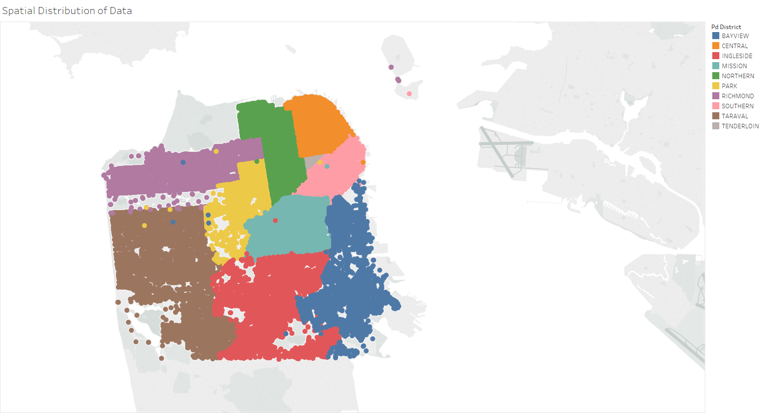
I do not intend to actually show all of these points. I just wanted to see if there was a distinct correlation between neighborhoods and police district activity. It looks like they are very closely correlated, so I feel that it is okay to have the first part of the visualization as an interactive map. This map will allow the user to click on a region that highlights on mouse-over. To be clear, this map visualization is meant to serve as the beginnings of a sort of "user interface" to allow the user to select a specific region to look at more closely. Upon clicking the region, the map should pan and zoom to the selected region. I did not find the pan and zoom necessary, and decided to not implement it.

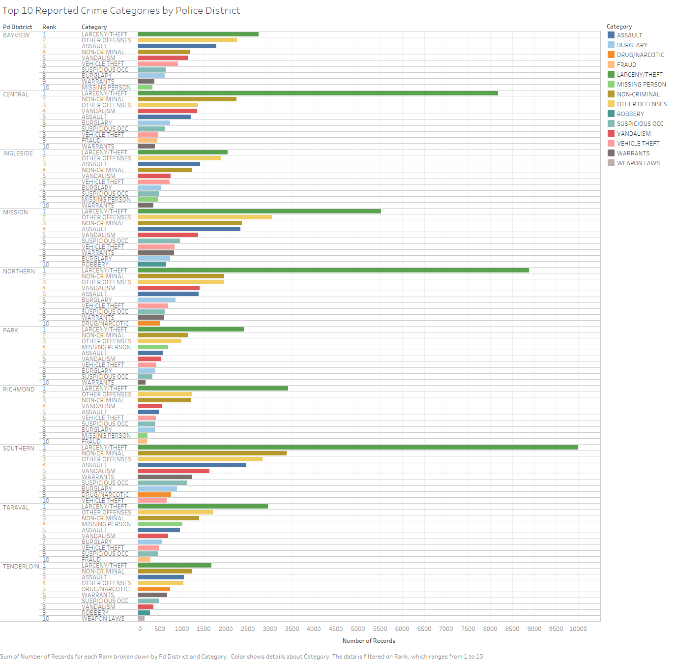
If no region is selected, this visualization should be to below the map. This visualization is a bar chart, where the X axis is the frequency, and the Y axis is the category. The chart is filtered by rank, so only the top 10 are showing. The planned interactivity for this visulization is that upon mousing over a bar, the user can see the percentage of reports that resulted in arrests for this crime.

I plan to have the above visualization to replace the display to below the map - but only showing the chart for that region. The visualization is a bar chart with the data grouped by district and sorted by rank. The X axis is the frequency of the crime, and the Y axis shows the category, rank, and district. The planned interactivity for this visualization is that the user can hover over the bar and see the percentage of reports resulted in arrests for that particular crime in that particular district. Maybe I can add another panel below the visualizations that accumulates the data from selected bars so that the user may make comparisons between regions or crimes more easily.
Beta Prototype

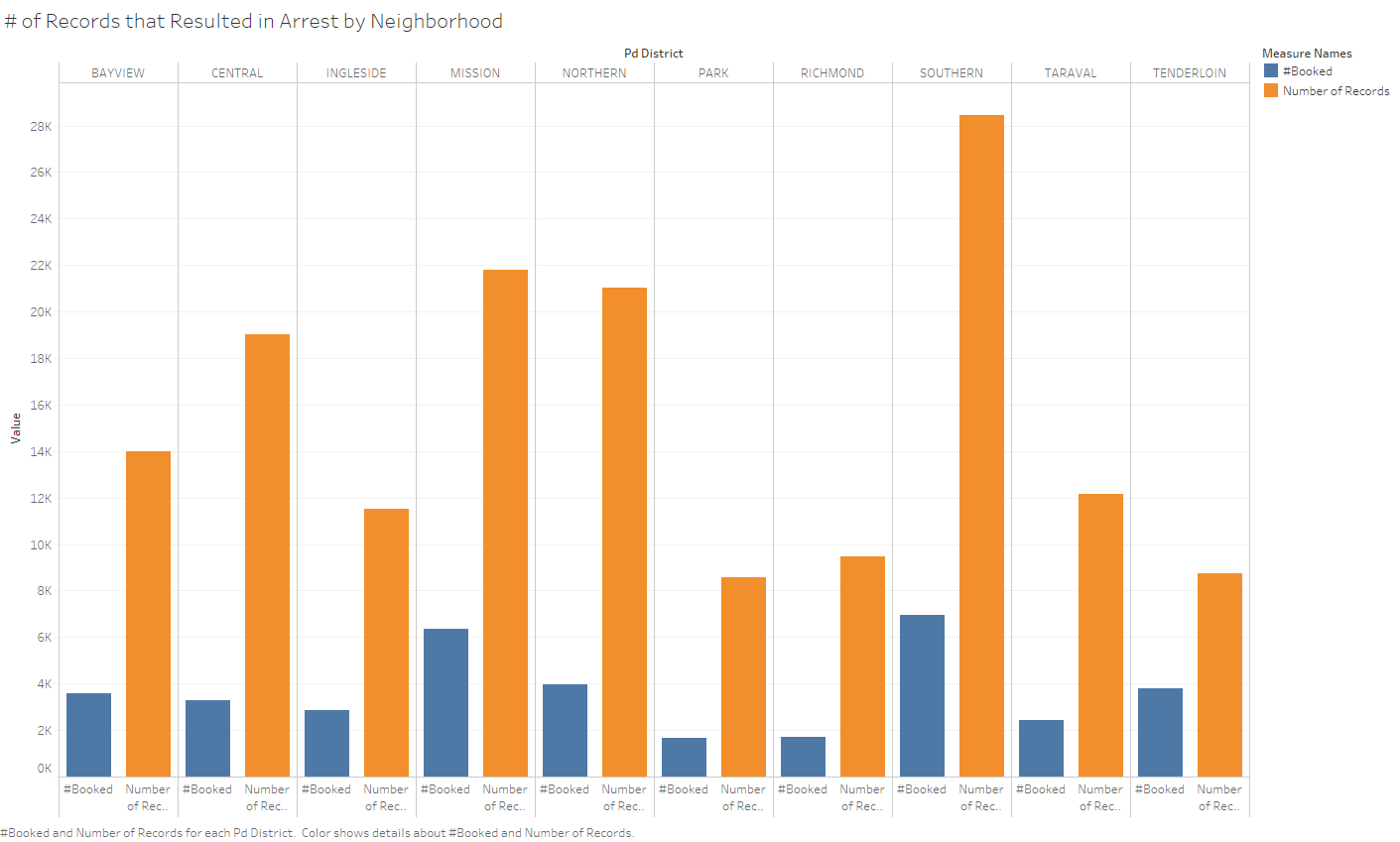
The purpose of this visualization is to show the percent of reported incidents that resulted in arrest. This information might be developed futher in d3 to calculate the percent of arrests per crime category in each zone the user looks at. This is a bar chart. I wanted to do a stacked bar, but Tableau was being difficult about stacking the bars. I think I would have an easier time implementing it in d3. The data encoded in the Y axis is the count of arrests in a police district as well as the total number of incidents. The X axis encodes the neighborhood used for the calculation and the calculation category. The color indicates the category (# Arrested vs Total). The planned interactivity for this visualization is to allow the user to see the calculated percentage of arrests as well as the total count. Additionally, if the user clicks on a bar, the visualization would change to show the distribution of crime categories. For example, if the user clicks on a # Arrested bar, the bar graph will change to show a pie graph or a stacked bar to show the distribution of crime categories.
Feedback
I was told that the data density for the visualizations was good. People seemed to appreciate the simplicity of the visualizations and how the data was organized. Many people said there were too many colors, so I opted to rely on the labelling of the bars to encode category information, and I saved the colors for the stacked bar categories and crime density.I also made sure to add color in a meaningful way. One reviewer said that I should think of a method to use the map I displayed in an efficient way. I think that by removing the previous explosion of color and replacing it with a subtle "heatmap"-esque scheme, the user can clearly see which district has the highest crime density at a glance, which I think is useful.