Prototype1

Goal

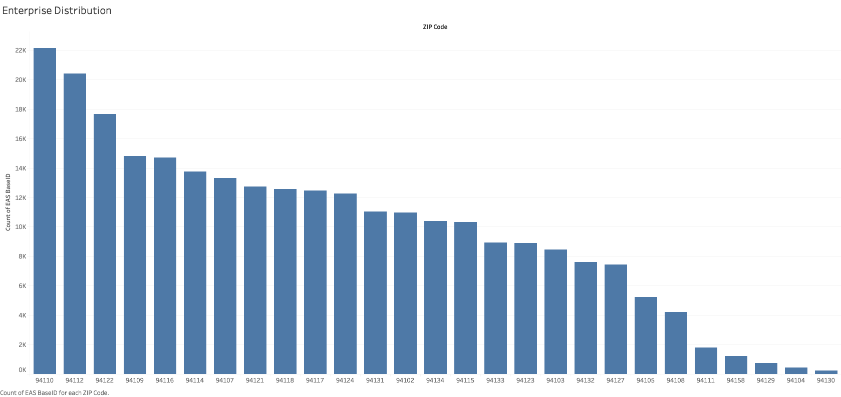
In this prototype, I want to show the enterprise distribution. So the audience can notice that the postcode of 94110 have the biggest number of enterprises. So maybe we can focus on top 3 or top 5 post code areas to get some interested result.

Interactivity

I plan to add brush in visualization. So if you move the mouse on a specific post code bar, you will get relative restaurant information from another chart.

Data processing

This is a bar chart. Where the column is a count of enterprises and the row is post codes.
Prototype2

Goal

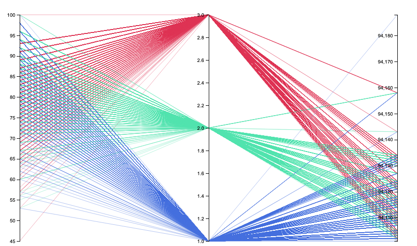
In this prototype, I want to display the relation of different risk categories with different post code areas. So, I can get distribution of every post code area. Like 94110 have the number of enterprises, then I can find the restaurant risk categories distribution in 94110.

Interactivity

I think to add filter to make it easy to find the postcode you want checked.

Data processing

This is a parallel coordinates plot, the first axis is Inspection Score on a linear scale, the second axis is risk category on a linear scale. I change original risk category elements of Low Risk, Moderate Risk and High Risk to 1, 2 and 3. And the last axis is post codes.

Prototype3

Goal

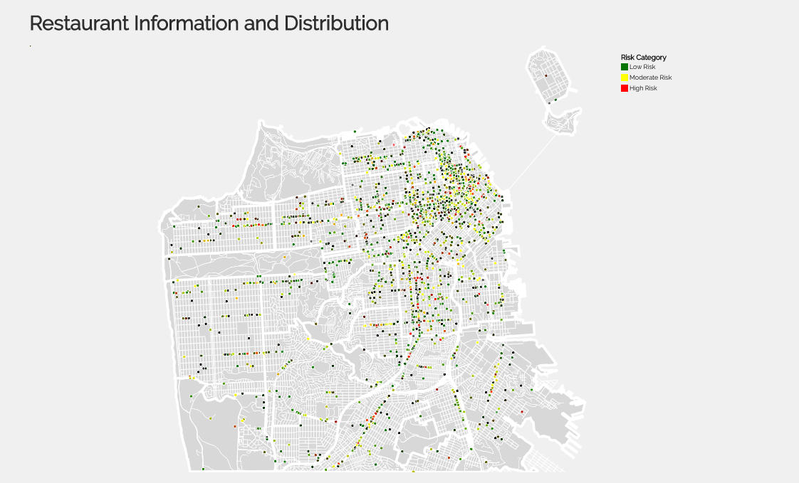
In this prototype, I want to display the distribution of restaurant. So I can find the most concentrated place. I predict the place with the most restaurants is the same place with the most enterprises.

Interactivity

I want to show more information of restaurant like Name, Addressand Violation. I also want to add zoom on map, maybe will add filiter of risk category to make it easy to finger out the distribution of different risk category.

Data processing

This is a proportional symbol map, dot represent restaurant. Red means this restaurant have high risk, green means this restaurant have low risk, and yellow means this restaurant have moderate risk. This is a parallel coordinates plot, the first axis is Inspection Score on a linear scale, the second axis is risk category on a linear scale. I change original risk category elements of Low Risk, Moderate Risk and High Risk to 1, 2 and 3. And the last axis is post codes.

Prototype4

Goal

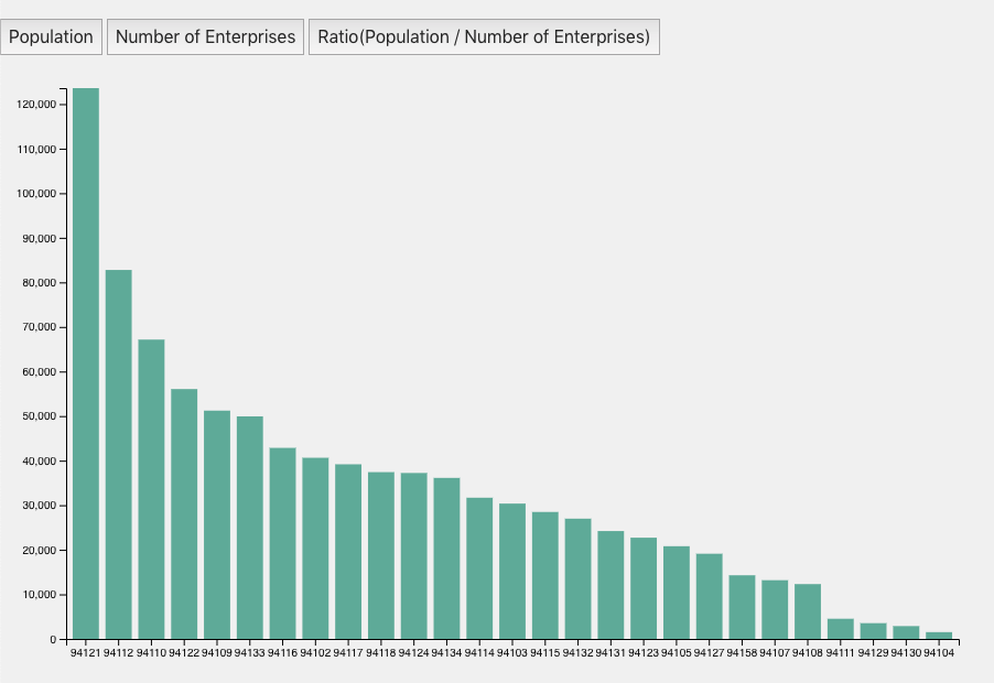
In this prototype, I want to show the population and enterprise distribution. So the audience can notice that the postcode of 94110 have the biggest number of enterprises. So maybe we can focus on top 3 or top 5 post code areas to get some interested result.

Interactivity

I plan to add filter in visualization. So you can get more information from one chart.

Data processing

This is a bar chart. Where the column is a count of enterprises, population or ratio and the row is post codes.

Prototype5

Goal

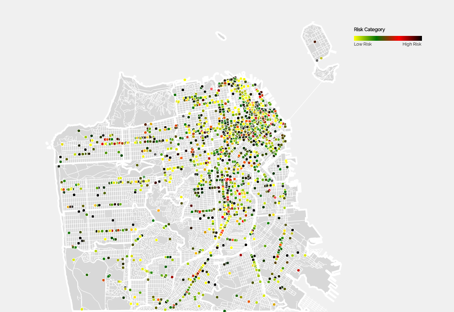
In this prototype, I want to display the distribution of restaurant. So I can find the most concentrated place. I predict the place with the most restaurants is the same place with the most enterprises.

Interactivity

I want to show more information of restaurant like Name, Addressand Violation. I also want to add zoom and tooltip on map.

Data processing

This is a proportional symbol map, dot represent restaurant. Restaurant risk from low to high is presented by yellow to green to red to black. This is a parallel coordinates plot, the first axis is Inspection Score on a linear scale, the second axis is risk category on a linear scale. I change original risk category elements of Low Risk, Moderate Risk and High Risk to 1, 2 and 3. And the last axis is post codes.