Feedback


From: Darianne Lopez
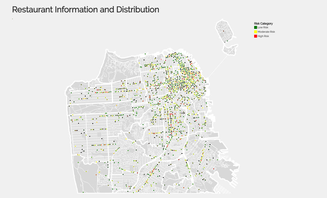
Lie Factor: I think your lie factor is fair as the map is a little small to read right now. This will help when adding the zoom interactivity that you mentioned.
From: John Murray
Color Encodings: Keeping it to 3 colors for map would be easier to understand.
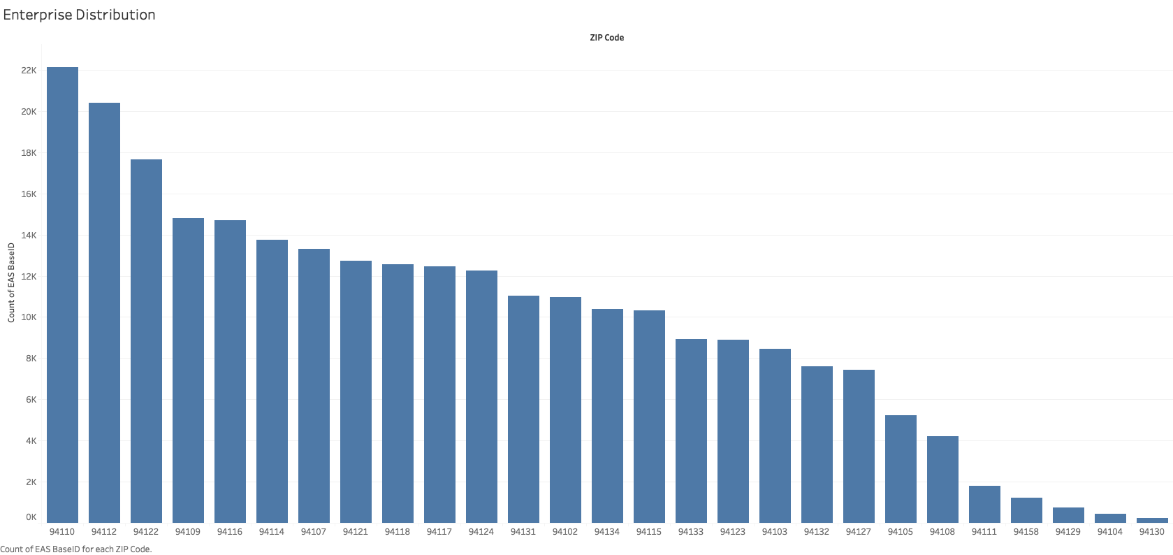
Context: Try to add some good filters/data for highlighting over bar chart.
Lie Factor: The black dots threw me off a little. I thought maybe you had another value that wasn't represented in the legend.
Design and Aesthetics: I would change the color of the bar chart to not blue.
From: Tony Jimenez
Color Encodings: I like your colors and they make sense, but they seem to not be correct in the visualization
Context: I think your context for the visualization is good but I would like more context and connections between your other visualizations as I don't really understand the connections.
Lie Factor: Just fix the colors.
From: Jordan Aldujaili
Color Encodings: Final vis should say what the black dots are.
Context: I think you could add something to say what type of risk i.e a high risk in what.
Data Density: Filtering will help with this, and I think it would help to increase the size of the circles.
From: Tong Wang
Color Encodings: The points on prototye 3 are more than 3 colors as indicated in color legend.
Data Density: A little bit dense, could be dealt with by using zoom interactivity.
Gestalt Principles: Less connection between prototype 1 and prototype 3, proto 1 is for enterprises and 3 is for restaurants.
What I did according to these feedbacks
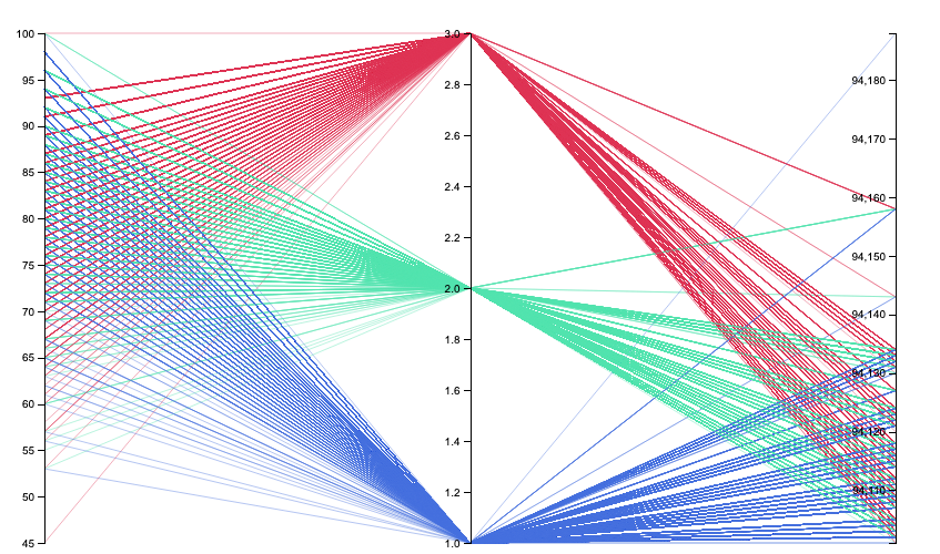
After summarize of feedbacks, Fro visualization1, I added filter to add more information in one chart. Because I want to use symbol map in visualization2, so I didn't add another map besides on bar chart. I changed the color and legend for visualization2. I also make circle a little bit bigger. And remove prototype2 since it's not a good way to use parallel coordinates plot.