Beta Prototypes
No-Hover View
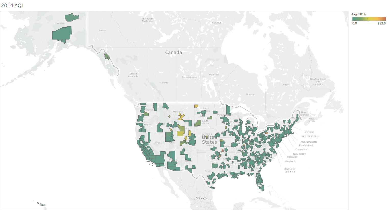
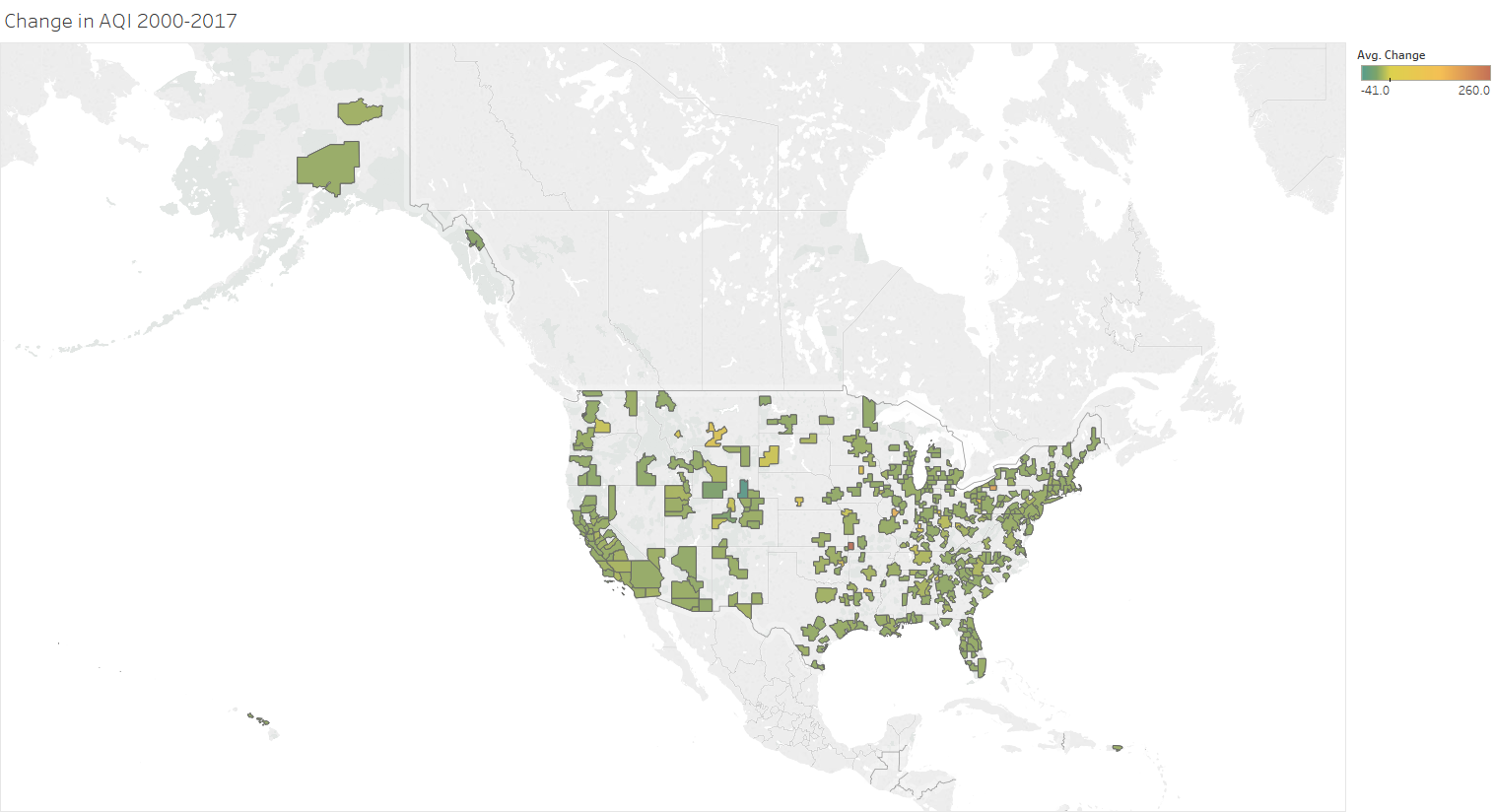
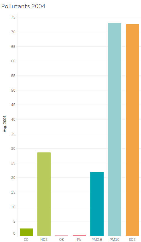
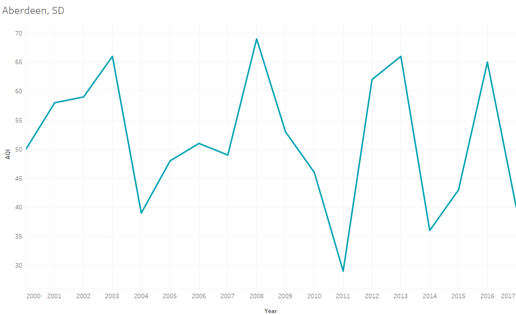
Hover View
Map Layout
Feedback
The above prototypes were used in an in-class prototype exercise where the presenters explained the concept behind the visualizations and peers gave verbal and written feedback. I mainly recieved positive feedback from my peers after showing them these prototypes but I did hear two critiques. The first one was regarding my tooltip bar chart pictured above. Instead of having multiple colors representing each pollutant, two of my peers suggested to used only one color because there was no need for a color to represent a pollutant if the x-axis labels the pollutants too. The final note was that my maps were hard to see as some counties are very small, especially on the east coast. This meant that my data density ratio was too dense for the size of my maps.
Although these evaluations were useful, I unfortunately could not implement the bar chart tooltip showing the pollutants. I had originally used a dataset for specific city information but unforunately could not create a map of U.S. citites. As a result, when I changed my data to focus on counties, the EPA did not have pollutant information per county, so that feature was lost. However, I still made two maps so I took my second collegue's advice and made the maps larger and not side-by-side, taking away the comparison aspect but allowed for two clear visible map visualizations.