No-Hover View
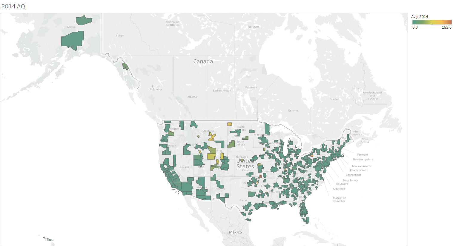
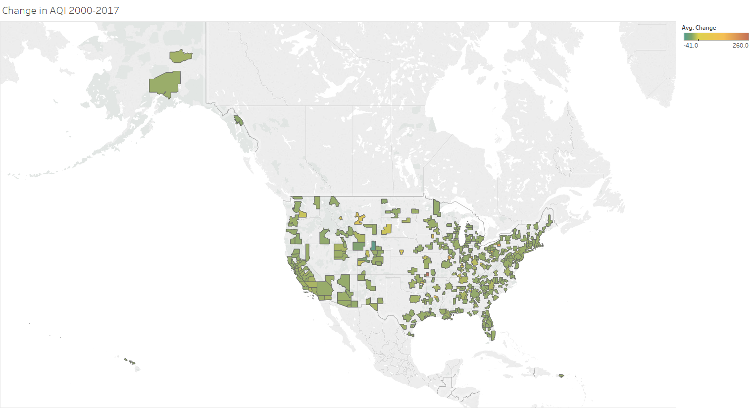
Goal: The goal of map on the right is to show the change in air quality index (AQI) of each core based statistical area (CBSA) from 2000 to 2017. The color indicates how much change has occurred. The redder the color is, the greater the change. This map provides context for the map to the left, which will show the AQI of each CBSA for one year. The "Change" map allows the user to identify areas with a greater change in AQI more easily so that they know which CBSA to focus on when they interact with the left map.
Interactivity: Instead of having 18 separate maps to represent each year, the D3 version will consist of only one map that has the ability to filter the data by year. The user will be able to see the colors change year by year by clicking on a scroll bar and moving the bar left or right to decrease or increase the years, respectively. A similar example can be found here. In addition, the map will have details on demand that are detailed below.
Encoding: The map on the left is a choropleth that colors each CBSA based on the average pollutant index reported for that year. The map on the right is a choropleth that colors each CBSA based on the change in the average pollutant index reported from 2000 to 2017.
Hover View
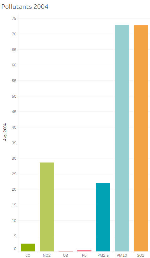
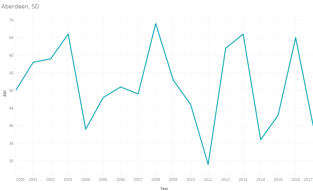
Goal: The goal of these visualizations is to provide the user with supplemental information on the AQI of specific regions. When the user hovers over a CBSA in "No-Hover View" map, the pollutants bar chart will appear to show the various pollutants that can be found in that region for the specific year the user has chosen. In addition, the "Change" map will no longer be shown and instead, a line chart will appear to reveal the AQI trend from 2000-2017 for the CBSA. There will be a vertical line (not pictured) originating from the x-axis at the year the user has chosen so that the data point corresponding to that year is easily identifiable.
Interactivity: The charts themselves will be static, however, when the scroll bar in the "No-Hover View" map is changed, so will the subsequent bar and line chart.
Encoding: The bar chart has the pollutants present on the x-axis and the AQI on the y-axis with bars are colored by pollutant. The line chart has the years on the x-axis and the AQI on the y-axis.
Example: Currently, the "No-Hover View" map shows the AQI of each CBSA for 2014, as if the user moved the scroll bar to 2014. If the user hovers over Aberdeen, South Dakota, the bar chart will appear, the "Change" map will disappear, and the line chart will take its place with a vertical line stretching from the x-axis to the top of the graph originating at the year 2014.
Map Layout
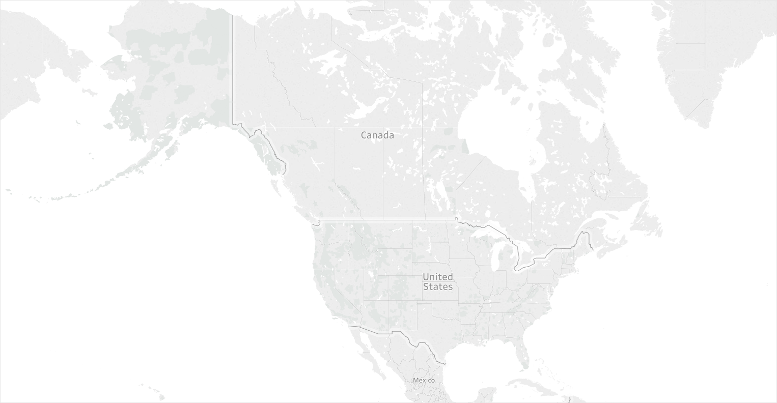
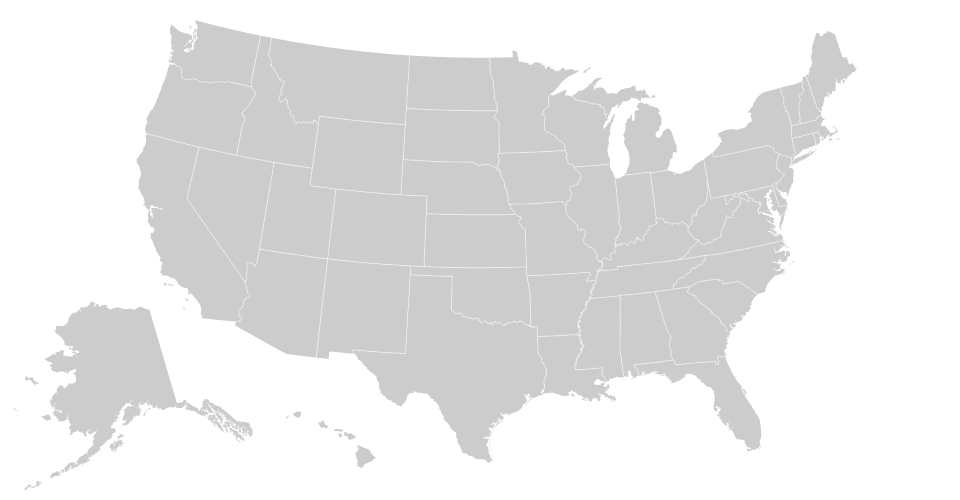
The final visualizations will have their map layouts changed from the continent view (pictured on the left) to the country view (pictured on the right). This will allow the user to see only the United States with Alaska and Hawaii in close proximity. The country view is a screengrab from Mike Bostock.