Prototype 1
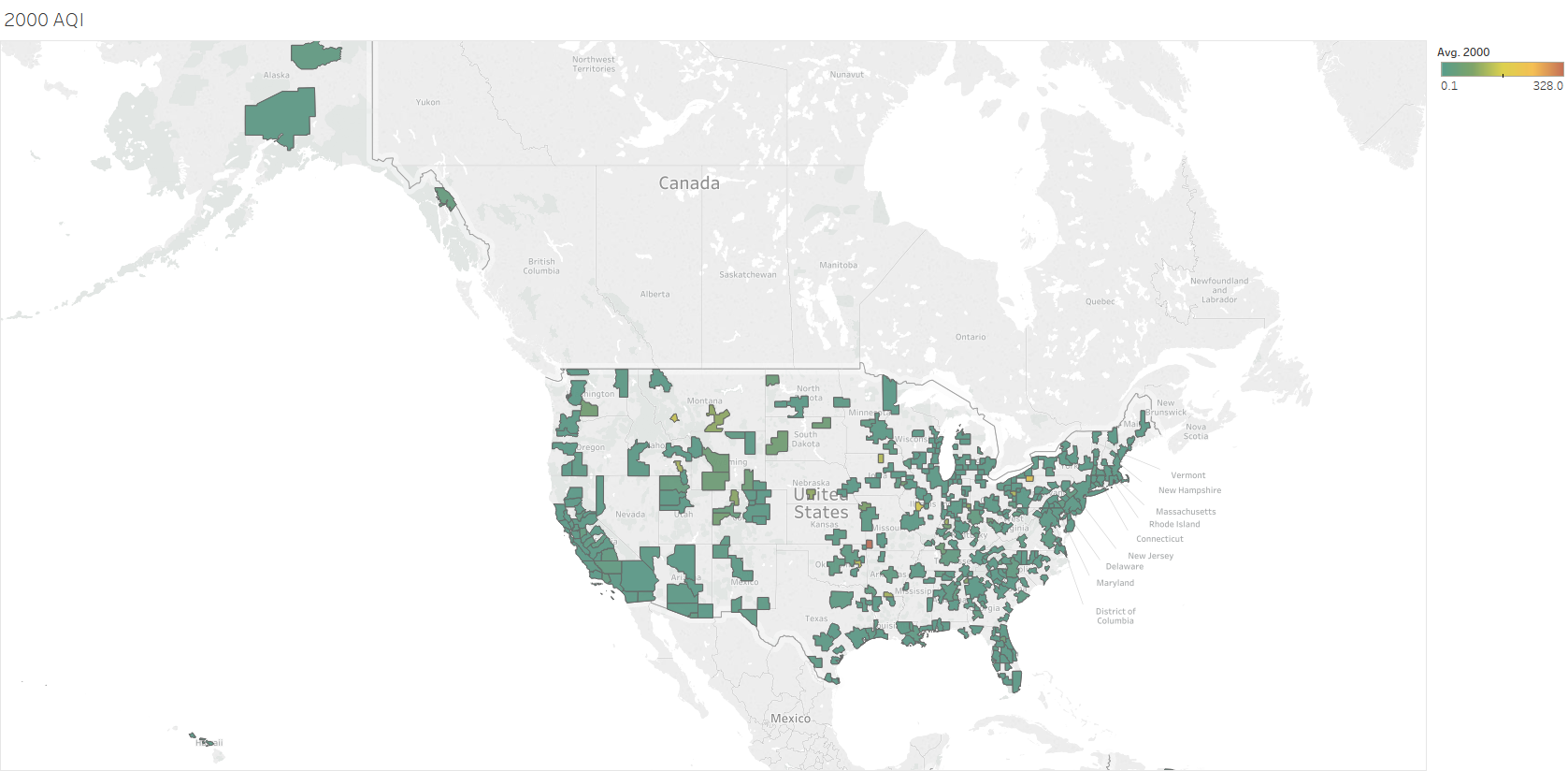
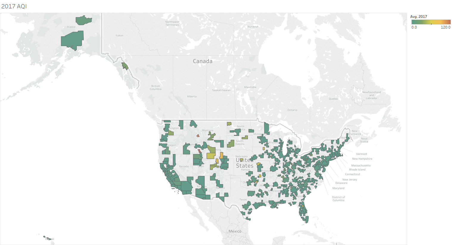
Goal: The goal of this visualization is to show the air quality index (AQI) of each core based statistical area (CBSA) from 2000 to 2017. From this, the user will be able to see areas that have levels of health concerns classified as "Good" with ranges from 0-50 colored green to areas with levels classified as "Hazardous" with ranges from 301-500 colored in red.
Interactivity: Instead of having 18 separate maps to represent each year, the D3 version will consist of only one map that has the ability to filter the data by year. The user will be able to see the colors change year by year by clicking on a scroll bar and moving the bar left or right to decrease or increase the years, respectively. A similar example can be found here. In addition, the map will have details on demand that show the name of the location of the CBSA and the AQI of the CBSA when the user hovers over the region.
Encoding: This map is a choropleth that colors each CBSA based on the average pollutant index reported for that year.
Prototype 2
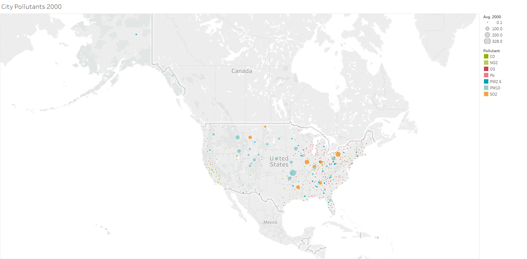
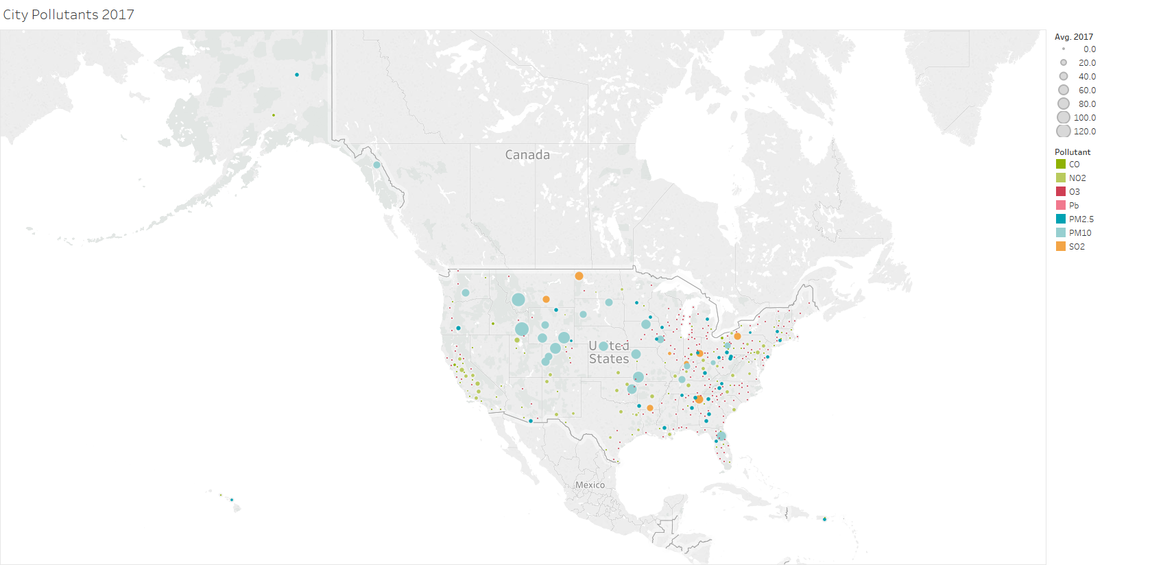
Goal: The goal of this visualization is to show the pollutants present for each core based statistical area (CBSA) from 2000 to 2017. From this, the user will be able to see which pollutants contribute to the AQI of each area.
Interactivity: Similarly to the interactivity of Prototype 1, instead of having 18 separate maps to represent each year, the D3 version will consist of only one map that has the ability to filter the data by year. This map will also have the scroll bar and detail on demand but the deatils this time will be the name of the location of the CBSA and the pollutant name when the user hovers over the circle.
Encoding: This map is a proportional symbol map that colors each circle based on the pollutant. The size of the circle correlates to the year's average index associated with that pollutant in that region.
Prototype 3
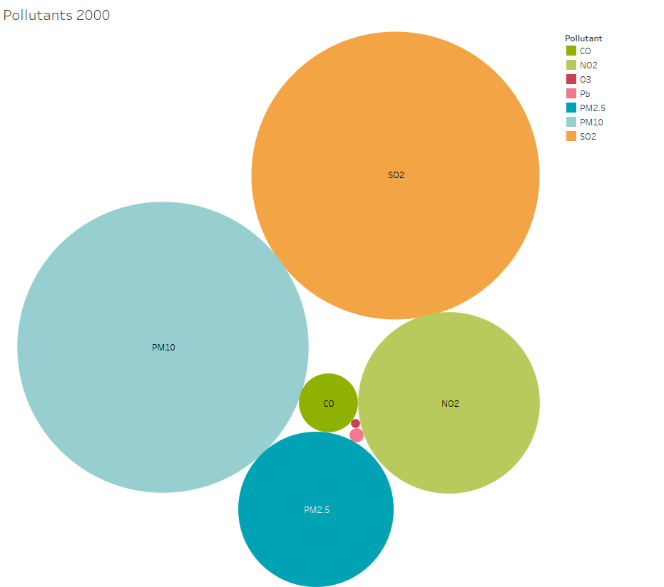
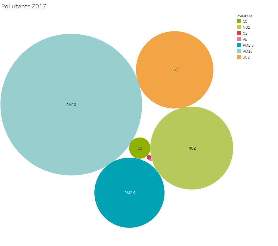
Goal: The goal of this visualization is to show the possible pollutants in our air. From this, the user will be able to compare the amount of each pollutant within each year and see the changes in pollutant quantities per year.
Interactivity: Again, there will be one map with a scroll bar to filter through the years like the first two prototypes. And the details on demand will show the trend statistic for that pollutant when the user hovers over the appropriate circle.
Encoding: This is a bubble chart that colors the packed circles based on pollutant. The size of the circle represents the year's average index associated with that pollutant in all CBSAs.