Violent crime rate evolution line chart(Beta)


Feedback
During my beta feedback sessions, I received a lot of positive feedback for both of my visualizations, and how they were going to work together to achieve my goal. Included in the table below are the rubric feedback I got from my peers, where I did not receive a full score.
| Criteria | Rating | Comment |
|---|---|---|
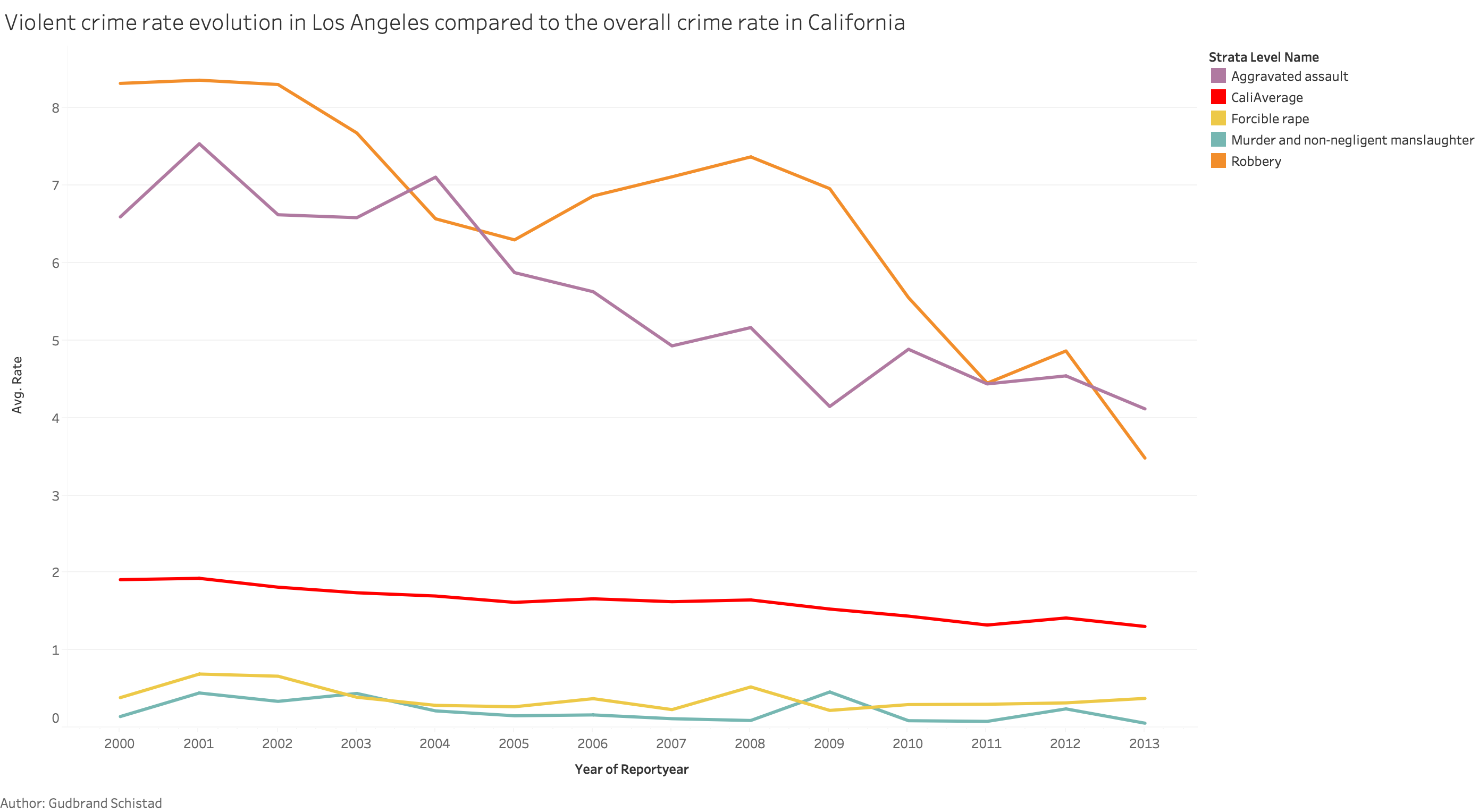
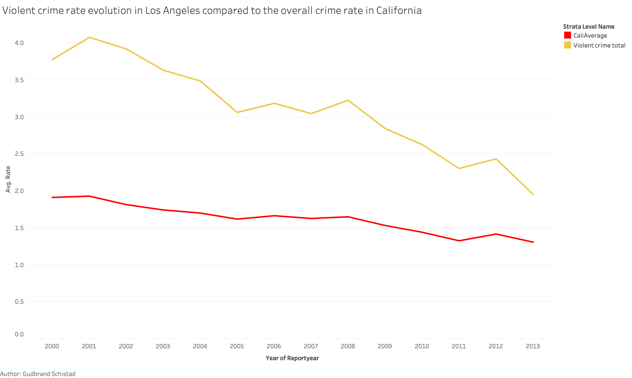
| Lie Factor | 4 | "I am confused by the inclusion of the California average for the violent crime rate in a graph that shows the rate for specific crime types in a specific county." |
| Lie Factor | 4 | "There is some sort of lie factor associated with the way that the color is encoded on the graph. Making the color chart stationary will help with this." |
| Data Ink Ratio | 4 | "The line chart hurts the data ink ratio which is why I think a stacked bar might be more useful." |
| Design And Aesthetics | 4 | "The design is good but figuring out a way to have complimenting colors will make the chart more appealing to look at." |
| Non-Color Encodings | 4 | "The map is solid, but I think that the line chart might not be the best implementation for the data you are using. I think a stacked bar chart might be more effective to show the different ratios." |
| Color-Encodings | 4 | "I like the use of different shades of red because it brings this urgent feel to the chart. Figuring out a way to have to color scheme of the line chart compliment the map would be beneficial." |
| Context | 4 | "Pretty good amount of context, but I think going into more detail about the meaning of the numbers would help make your viz more readable." |
One of the first issues I encountered with my beta release was the confusion about the ratio, as the word itself does not provide a lot of meaning. It, therefore, became very important for me to make sure that I gave a clear explanation of what the ratio represented so that the visualizations would not be interpreted incorrectly. I, therefore, made sure to explain what the ratio represented in both my visualizations.
I also received some feedback that the colors in the multi-line chart were not complimenting, the colors of the choropleth map. Since the map only used different shades of red, it became difficult to find any color scheme that would complement the map without making it difficult to differentiate the colors from the color legend to the correlating line. I, therefore, decided to go for colors that helped the user differentiate between the lines rather than complimenting the map.
There was also so confused about the California average line, and why that line was shown when showing the different crime types. To solve this I tried to add 4 lines, each representing the average California crime rate for a specific crime type. I did, however, feel that this just created a lot of noise in my visualization, and just made it more difficult to analyze. I, therefore, decided to keep it as it is, and rather provide some more detail about what the California average represented.
The last comment that I received suggested using a stacked bar chart, instead of a multi-line char. I did however not use this because I felt that a line chart would represent time series data in a more understandable way than a stacked bar chart.