Interpretation
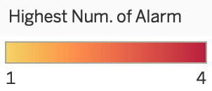
This is a packed bubble chart that depicts each neighborhood our group has chosen focusing on the highest number of alarm that has been reached. The number of alarms reflect on how severe the incident is. You would think that the neighborhoods with higher number of records would reach a higher number of alarm, however take Tenderloin as an example, it has the highest number of records but never passed 1 in highest number of alarm reached. It's also interesting how the two neighborhoods with the lowest number of records (Chinatown and Russian Hill) are the top two in reaching the highest number of alarm.
Conclusions
This chart concludes that the number of records in a neighborhood does not reflect on how severe the incidents could be. You could say that a neighborhood with less number of records have more severe incidents compared to ones with high number of records.
Credit
Chart inspired by Anaelia Ovalle's Bubble Chart for SFPD Incidents in December 2016.
Numbers formatting in tooltip inspired by