Notes/Takeaways
Original Prototype


Feedback Recieved
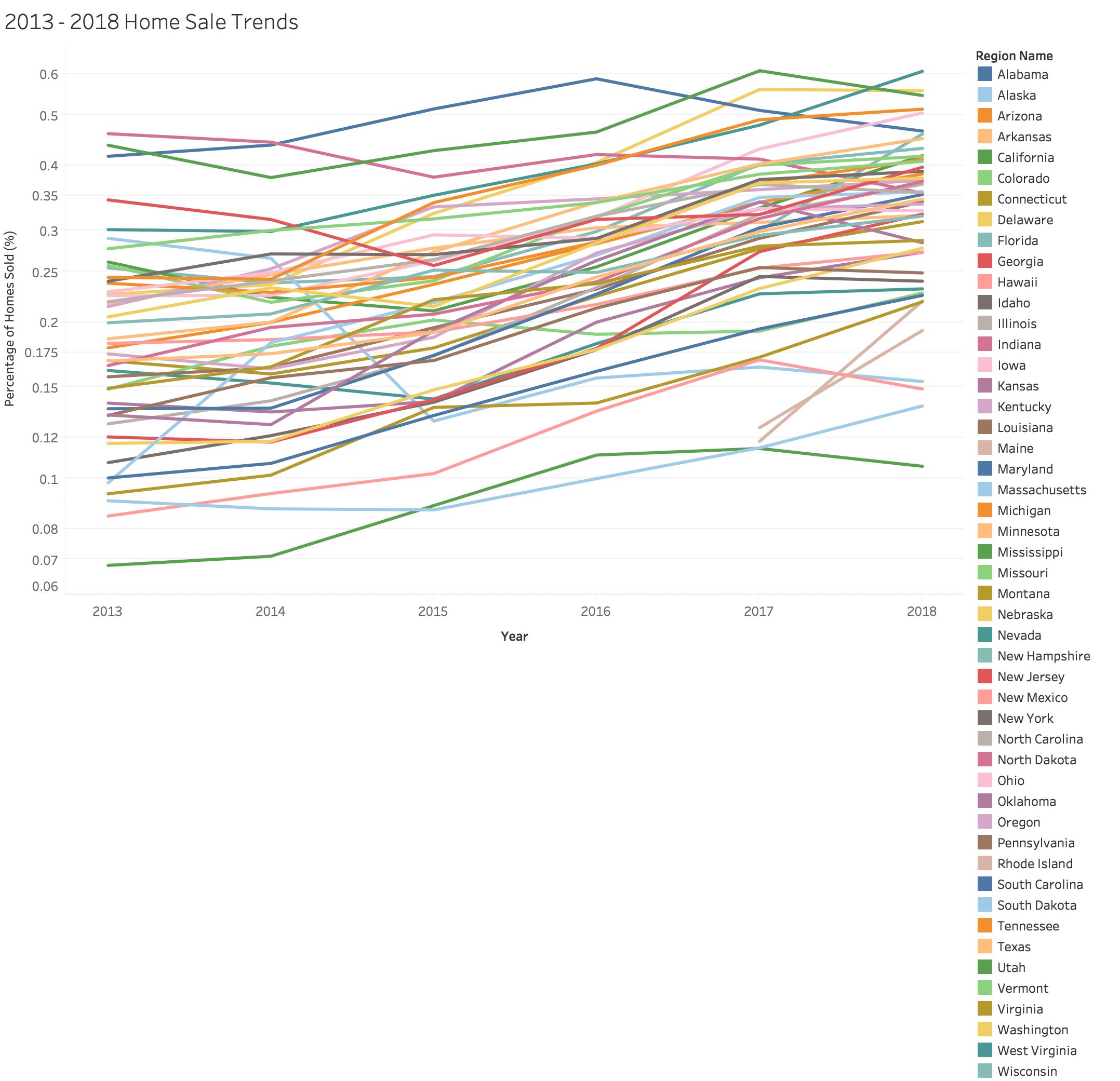
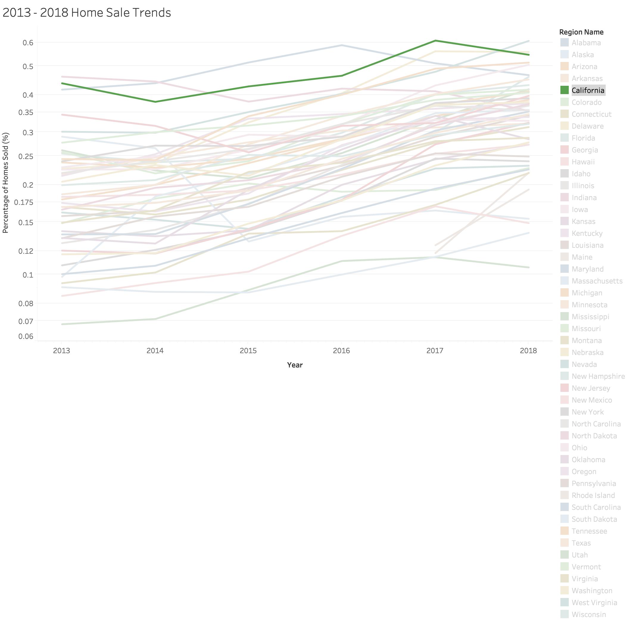
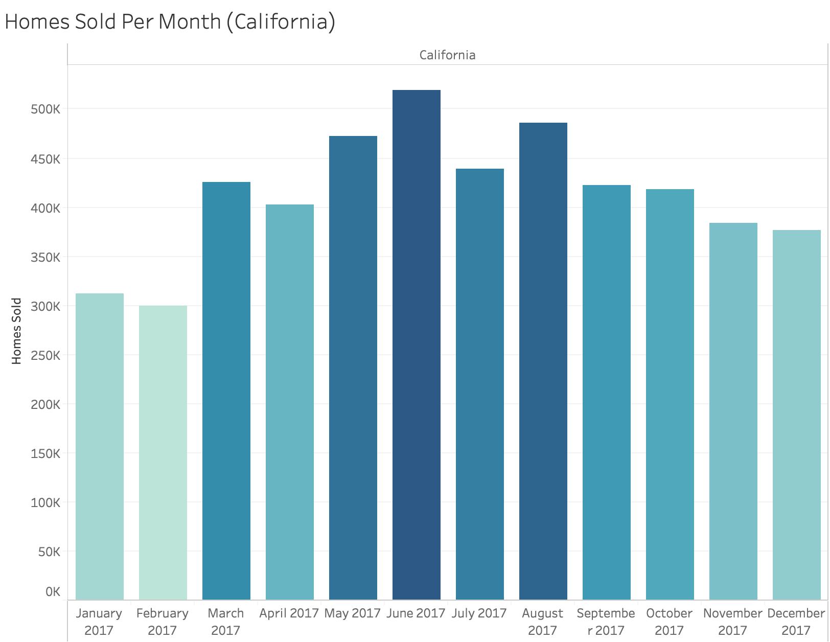
The above visualization was used for the feedback exercise during class. I was adviced to add a lot of interactvity to this graph in order to make it seem less cluttered and be more effective. My peers really seemed like the idea of greying out other states when trying to focus on one. Also, I had a gradient bar chart, but was recommended to have it one color, preferably the state's color it was associated to.
Final Version
After listening to the feedback, I did change my final version of this graph. I added a lot of interactivity that included a lot of isolating and focusing of the different states in order to see the trends more clearly. I also tried to make the color scheme more cohesive.