Beta Release Prototype


Goals and Interpretation
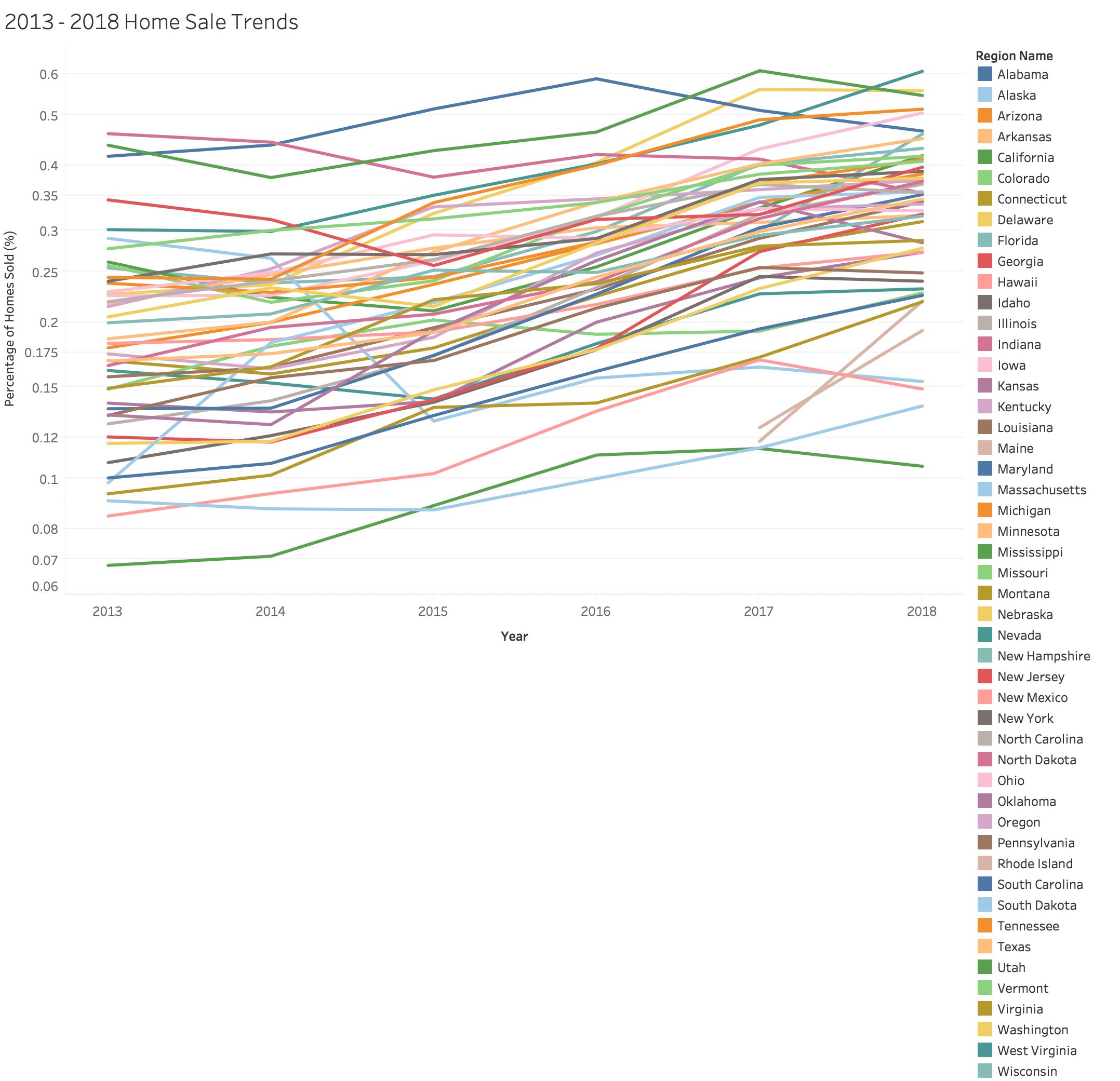
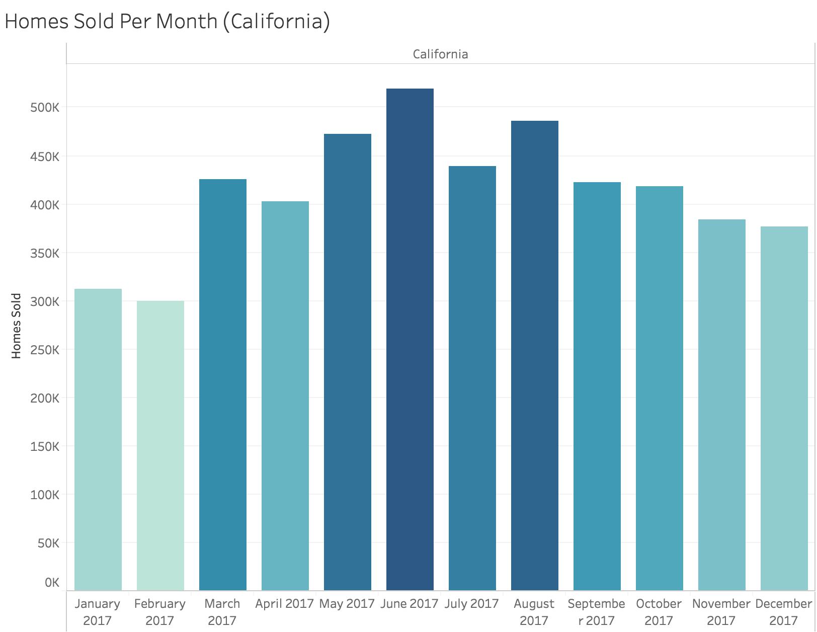
The above visualizations are meant to show the trends of home sales over the last 5 years. The x-axis is the years and the y-axis is the percentage of home sales. The bar chart in the interactions aspect of the visualization will show the number of home sales per month of the specific year and state selected. This visualization is aimed to see the trend of home sales per state over 5 years and to see when people tend to buy their homes throughout the United States.
Planned Interactivity
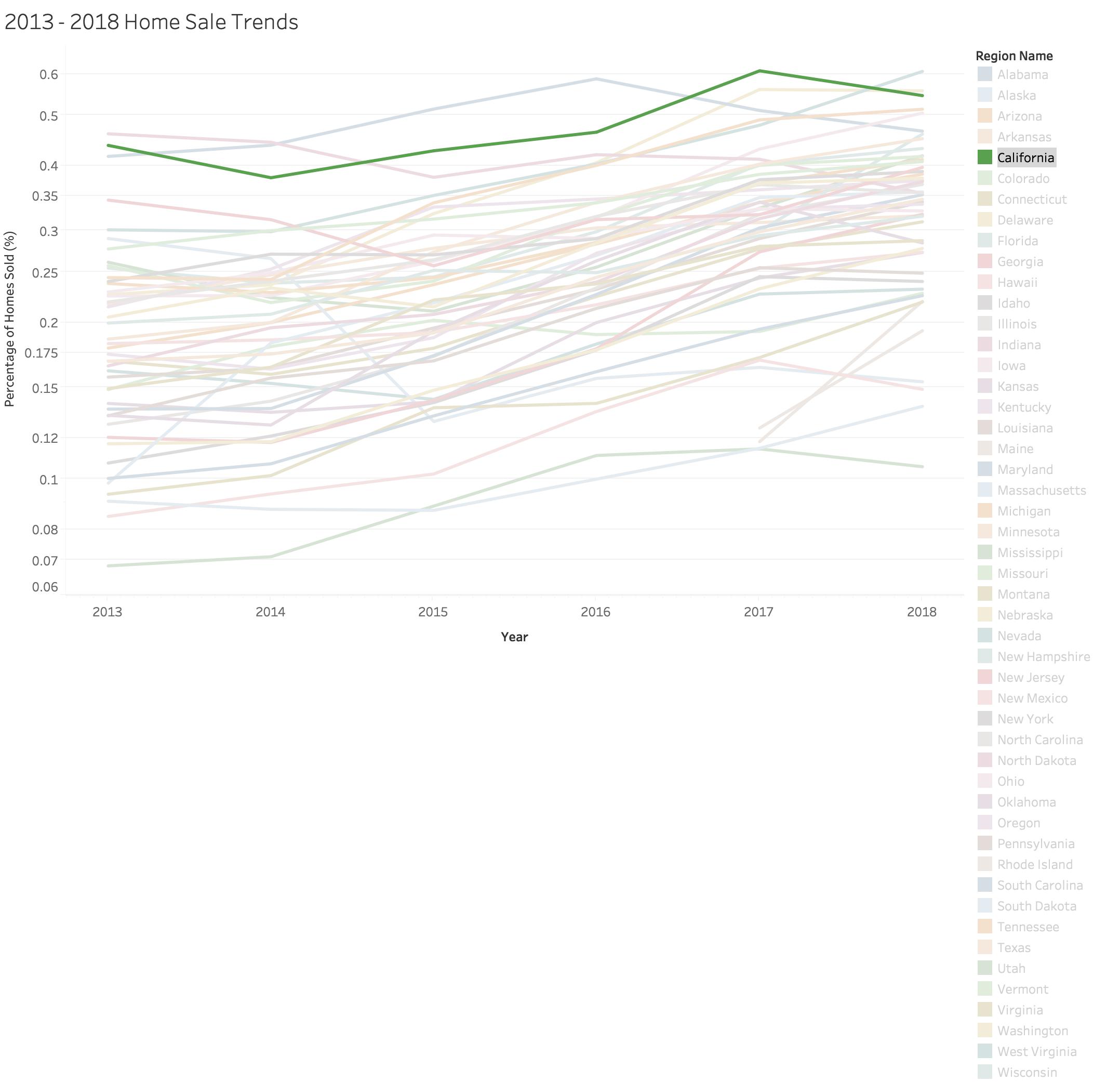
Planned Interactivity is to allow filtering of the lines on the graph. For example, you can isolate California by greying out the rest of the states. In addition, when you hover over a point on the graph, the x-cordinate being a certain year and y-coordinate being a percentage of sales of a certain state, a bar graph will be displayed to show the number of sold homes throughout the months during the chosen year and state.
Data
This is a Multiple Line Graph, where each line represents a different state in the United States. The states are colored differently for indetification purposes. The date columns range from years 2013- 2019 and is encoded as the x-axis on a linear scale. The percentage rows range from 0.0-0.60% and is encoded as the y-axis on a linear scale. The percentage is calculated by dividing the number of homes sold by the number of homes listed for sale over the 12 months of a specific year. Each state is mapped on the graph as a line in a different color. The bar chart displayed with interactivity will have a count of homes sold encoded as the x-axis and the months in the year encoded on the y-axis. Each bar is color coded to identify the greatest count depicted by the darkest color and the lowest count depicted by the lightest color.
